ARCHI./NEWS2010. 4. 24. 20:23
 
April 22nd, 2010

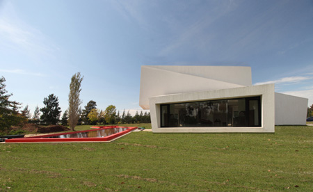
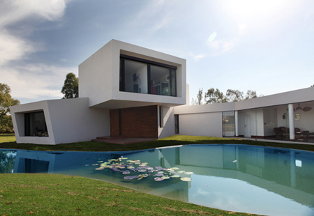
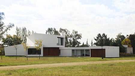
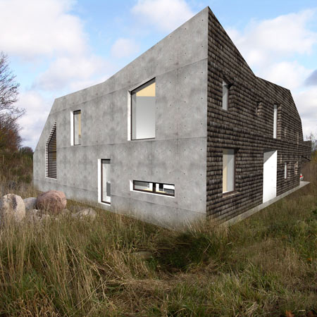
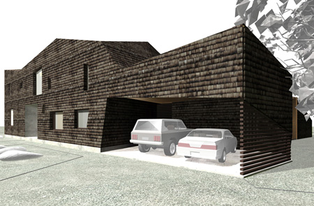
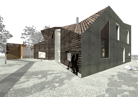
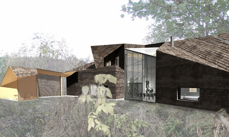
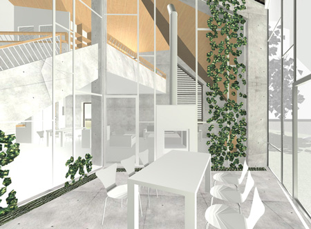
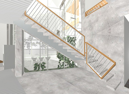
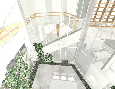
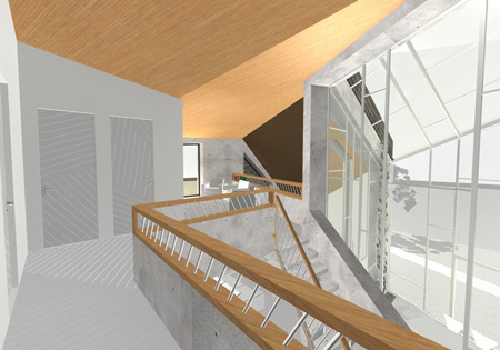
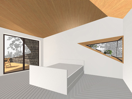
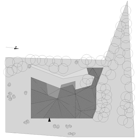
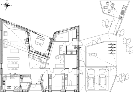
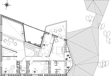
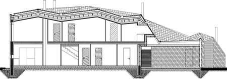
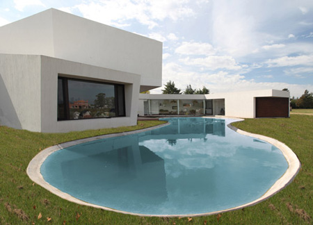
Argentinian studio Andrés Remy Arquitectos have completed a house in Pilar, Buenos Aires, consisting of volumes stacked at sloping angles.

Called Casa Orquidea (Orchid House) the concrete building has large recessed windows, with smaller openings in the south facade.

The following information is from the architects:


The Orchid was a challenging project, committed by a young couple with two sons, enthusiastic about sustainable architecture. After consulting several architects, they gave the commission to Andrés Remy, who had investigated these concepts in New York at Rafael Viñoly’s Studio for four years.

Sustainability implies a lot of varieties, such as efficient and rational use of energy and water, natural ventilation and lighting, and low-environment-impact materials. The house has the best orientation, possible thanks to the large lot. The concept came from the client’s hobby, growing orchids. The house is based on the different parts of the orchid: the roots, the stem and the flower.

The sun rays impact in the interior of each room, were also studied, to determine the optimal depth to place the windows. This gives a unique volumetric outcome to the project. Taking advantage of sun rays in winter increases the interior temperature up to a comfortable level. The design includes glazed volumes with good thermal insulation and small windows in the worst orientation, such as the south facade. The windows consist of aluminum frames supplied with thermal bridge breaker and double-hermetic-glass. A wide variety of insulating materials were also used, as well as water based paint and wall and roof air chambers.


In the lower floor, the convenient location of the opening windows allows natural air flow helping to decrease the humidity in the room. What’s more, the big thresholds create a good distribution of fresh air. All this, gives account of the complexity of the house, a glass and concrete flower, designed according to a program of needs and the client’s concerns.

Credits
Design: Andrés Remy Arquitectos
Desing Team: ANDRES REMY, HERNAN PARDILLOS (asociated), LUCILA LOPEZ, PAULA MANCINI, JULIETA RAFEL.
Colaborators: LILIAN KANDUS, CORAL BANEGAS, GISELA COLOMBO, DIEGO SIDDI, MARTIN DELATORRE, JUAN ETALA, SEBASTIAN REMY.
Design Process: six months.
Date of completition: December 2008
Location: The house is located in a closed neighborhood called “Haras del Sol”, in the city of Pilar, province of Buenos Aires, Argentina.
Lot size: 3640m_
Lower floor: 325m_
Upper floor: 140m_
Total: 465m_

'ARCHI. > NEWS' 카테고리의 다른 글

German Pavilion by Schmidhuber + Kaindl  (0) 2010.04.28
Ark House by Axis Mundi  (0) 2010.04.24
Castelo Novo by Comoco Architects  (1) 2010.04.24
Embassy of the Czech Republic  (0) 2010.04.24
1111 Lincoln Road by Herzog & de Meuron  (0) 2010.04.21
Posted by 살구ISUE
ARCHI./NEWS2010. 4. 24. 19:47
 
April 23rd, 2010

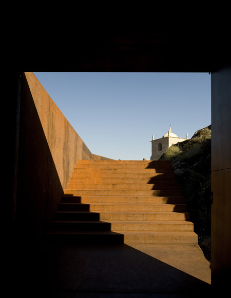
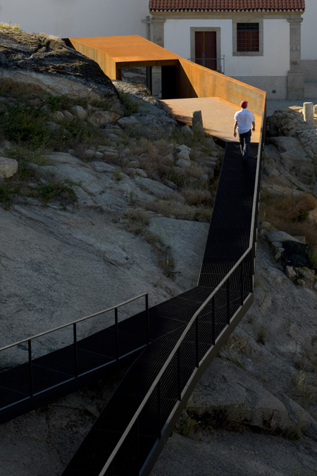
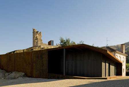
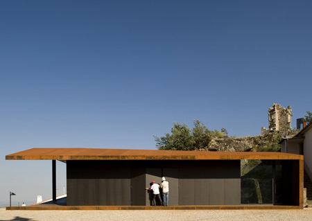
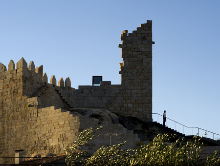
Here are some images of a visitors centre with walkways built through and around a castle in Fundão, Portugal, by Portuguese studio Comoco Architects.

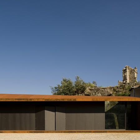
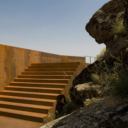
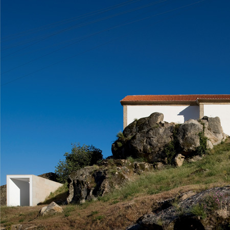
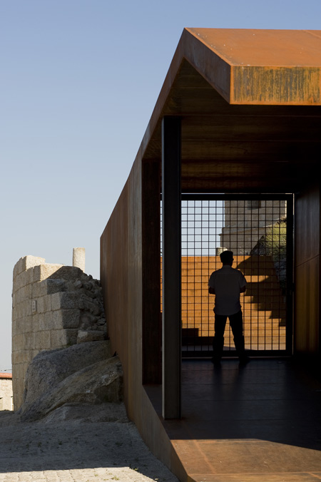
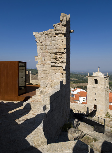
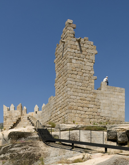
The new addition to the Castelo Novo comprises a pedestrian walkway, ramps and stairs, which guide visitors from a church square through the castle to a multimedia display inside a steel box in the main tower.

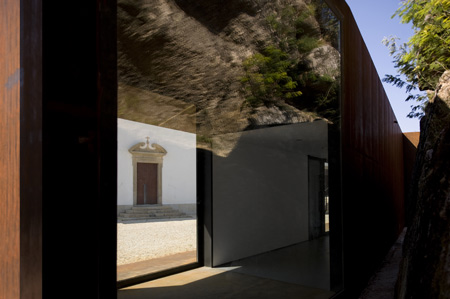
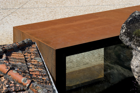
A rectangular structure with a folding facade sits further down the hill from the castle and is where the walkway begins.

Photographs are by Fernando and Sergio Guerra.

The following information is from the architects:


The project’s brief requested the conservation and valorization of Castelo Novo’s Castle and surroundings. Moreover, it suggested also the creation of a space where people and visitors could enjoy it as a place of permanence.

To answer these demands, the design solution created a “body” without a rigid boundary, organic, working independently of the existing structures but using them as a support. The construction was designed as a continuous abstract object, non-identifiable with a unique and specific purpose.

The object changes with the characteristics of the site. While in the church’s square it acts as a volume defining the limits, in the interior of the Castle’s walls, its shape is transformed into a pavement layer with ramps and stairs creating a pedestrian pathway which is suspended from the ground by metallic structure.

This solution allows the visitors to admire the archeological findings without damaging them. The pathway finishes in the castle’s Main Tower where a “steel box” was inserted in its interior containing a multimedia room.

This box allows also the creation of a platform where visitors can enjoy a panoramic view of the landscape. A

ll the construction was made using lightweight metal structures which can allow a clear distinction of the new object from the existing structures and, at the same time, the reversibility of the operation.

Project Credits

Location: Castelo Novo, Fundão
Client: Fundão Municipality
Architecture: Luís Miguel Correia, Nelson Mota, Susana Constantino with Vanda Maldonado

Date: 2003-2008
Area: 3650m2
Engineering: Direcção-Geral dos Edifícios e Monumentos Nacionais (DGEMN)

Building Contractor: General Contractor: STAP – Reparação, Consolidação e Modificação de Estruturas, S.A.
Landscape: Serrasqueiro e Filhos, lda
Photography: FG+SG – Fotografia de Arquitectura

'ARCHI. > NEWS' 카테고리의 다른 글

Ark House by Axis Mundi  (0) 2010.04.24
Casa Orquidea by Andrés Remy Architects  (0) 2010.04.24
Embassy of the Czech Republic  (0) 2010.04.24
1111 Lincoln Road by Herzog & de Meuron  (0) 2010.04.21
Liiva House by Muru & Pere  (2) 2010.04.16
Posted by 살구ISUE
ARCHI./NEWS2010. 4. 24. 19:41
 
April 23rd, 2010

Czech architects Chalupa Architekti have won a competition to design the new Embassy of the Czech Republic in Washington DC, USA.

Here’s some text from the architects:


Embassy of the Czech Republic in Washington, DC, USA

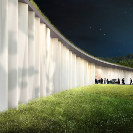
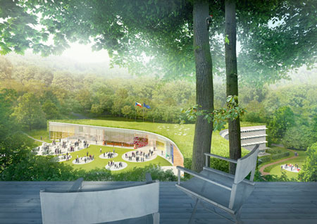
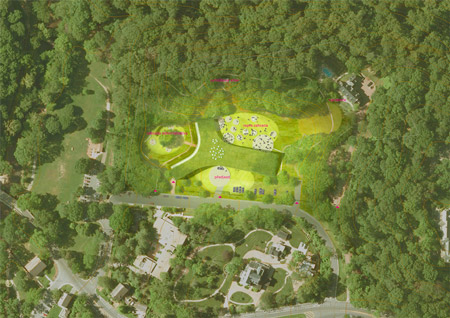
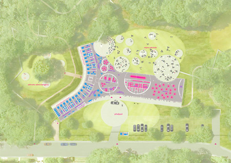
The design of the Embassy of the Czech Republic pays tribute to its unique natural setting, and the building itself is only an adjunct, not the main actor. Its form divides the site into three separate parts.

Firstly what emerges is a representational circular driveway space, the austere elegance of which underlines the drapery-like front façade made of frosted glass. Secondly, it creates a private garden space linked to the apartments and offices used for more working-like meetings.

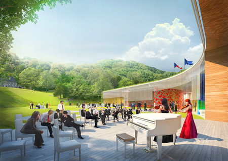
Finally, there is the representational garden space which forms the conceptual core of the project. The garden is generously dimensioned, organically connected with the main lounges of the Embassy, and mediates a strong contact between the new building and the existing residence of the ambassador.

Designing the Embassy of the Czech Republic in Washington poses the special challenge (apart from the obvious creation of an environment suitable for work and meetings) of how to represent the Czech Republic abroad. It does not attempt to show what we are like, but what we would like to be like, or how we wish to be seen to the world: open, confident, friendly, helpful, and respectful, considerate to Nature and the environment in general, firmly rooted in rich cultural traditions and with respect to democratic principles; and always ready to help. Our hope is that the new Embassy building will foster this understanding.

1. prize in a competition to design

Embassy of Czech Republic in Washington, DC, USA

architects: Chalupa architekti / Marek Chalupa, Stepan Chalupa, Tomas Havlicek, Michal Rosicky, Tomas Horalik, Jakub Chuchlik

collaborators: Adam Gebrian, Petr Babak / Laborator, Zdenek Sendler, Vit Musil + Radim Petruska / miss3

location: 3900 Spring of Freedom St. NW, Washington, DC, USA

client: Czech Republic – Ministry of Foreign Affairs

design period: 07/2009–02/2010

gross floor area: 5 490m2

'ARCHI. > NEWS' 카테고리의 다른 글

Casa Orquidea by Andrés Remy Architects  (0) 2010.04.24
Castelo Novo by Comoco Architects  (1) 2010.04.24
1111 Lincoln Road by Herzog & de Meuron  (0) 2010.04.21
Liiva House by Muru & Pere  (2) 2010.04.16
Swarovski Crystal Palace 2010  (0) 2010.04.16
Posted by 살구ISUE
ARCHI./NEWS2010. 4. 21. 10:05
April 19th, 2010

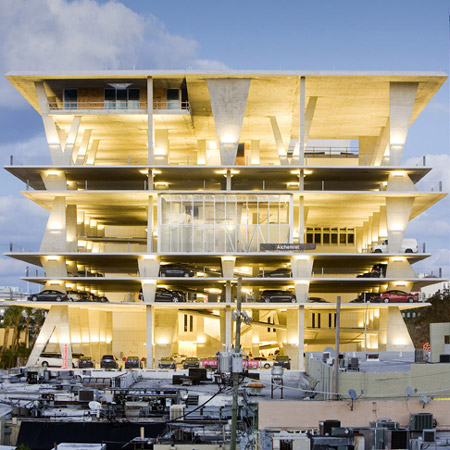
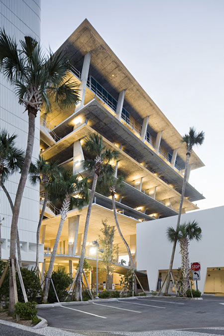
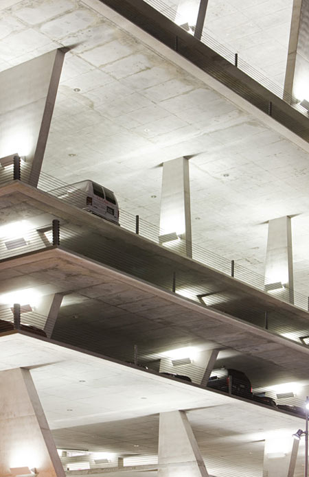
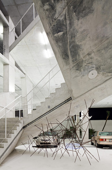
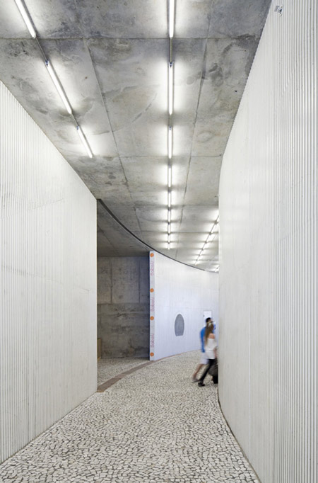
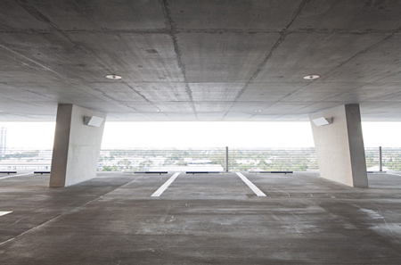
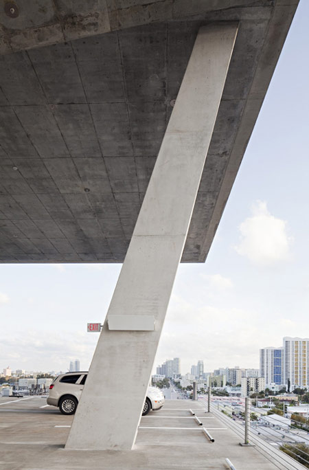
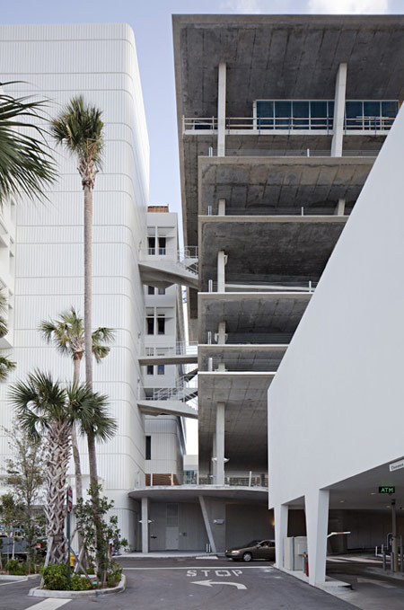
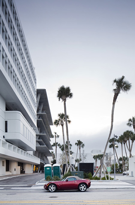
Photographer Nelson Garrido has sent us these photographs of the recently-opened car park in Miami by Swiss architects Herzog & de Meuron.

예전에 건축학교를 설계하면서 내가 원했던 이미지가 이것과 비슷했다.
물론 건물의 용도가 다른 만큼 디테일은 많은 부분이 달라야하겠지만, 기본적인 공간 구성은 내가 원했던 그것과 비슷하다.
원하는 이미지를 온전히 구현하는 일은 참 어려운 것 같다.
Herzog 와 Meuron은 흥미로운 디자인을 제시하였다. (여담...  반짝반짝 이쁜데, 뭔가 눈 부시다.)

Called 1111 Lincoln Road, the building incorporates 300 parking spaces.

Eleven shops and three restaurants are located at ground level, with further shopping on the fifth floor and another restaurant on the roof.

All photographs ©Nelson Garrido/1111Lincoln Road Shot Reprinted with permission from MBeach1, LLLP

The information below is from the developers:


Envisioned by Robert Wennett and designed by Herzog & de Meuron, 1111 Lincoln Road represents the collaboration of renowned architects, landscape architects, artists and designers to create a unique shopping, dining, residential and parking experience for Miami’s residents and visitors.

Situated at the gateway to Lincoln Road’s pedestrian promenade, 1111’s mix of exclusive, internationally diverse retailers will once again restore this long-dormant strip to its former position as the city’s premier retail location.

Constructed of concrete and glass, 1111 Lincoln Road is described by architect Jacques Herzog as pure Miami Beach – “all muscle without cloth”.

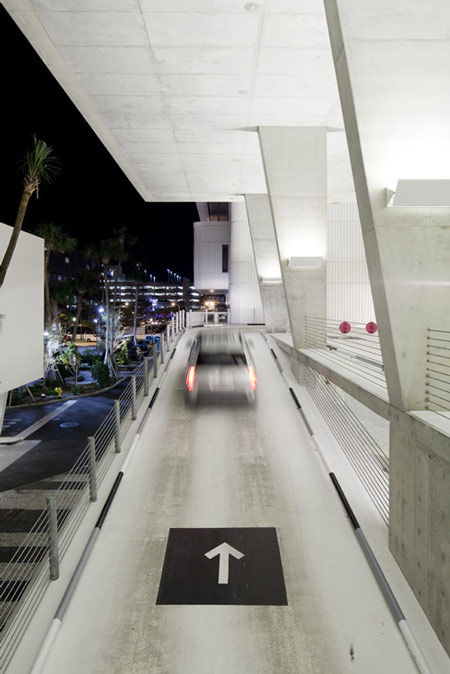
Each level of the sculptural parking facility is filled with natural light, creating successively striking vistas of the city.

At its base, the retail spaces offer unobstructed access to a newly transformed public space.

1111 encompasses 40,000 square feet for 11 street-level retail concept stores and three restaurants, as well as a uniquely-situated 5th floor retail store.

'ARCHI. > NEWS' 카테고리의 다른 글

Castelo Novo by Comoco Architects  (1) 2010.04.24
Embassy of the Czech Republic  (0) 2010.04.24
Liiva House by Muru & Pere  (2) 2010.04.16
Swarovski Crystal Palace 2010  (0) 2010.04.16
Autostella by Supermachine Studio  (0) 2010.04.13
Posted by 살구ISUE
ARCHI./NEWS2010. 4. 16. 10:36
April 15th, 2010

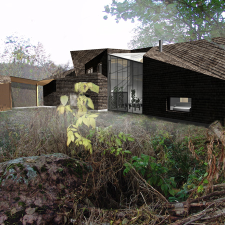
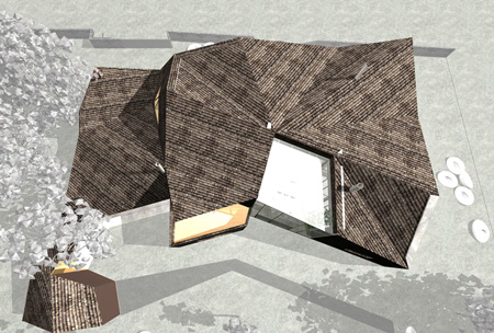
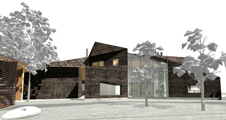
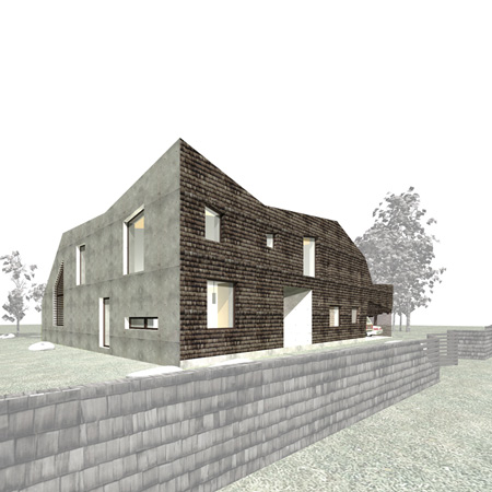
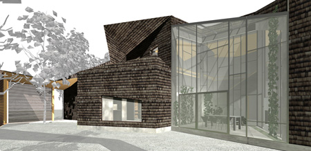
Estonian architects Urmas Muru and Peeter Pere have designed a house for a fishing village near Tallinn, covered in shingles on all surfaces except for one white concrete wall.

Called Liiva House, the building has a faceted roof creating an angular form with irregularly-spaced windows.

There is a full-height glass wall located at the rear of the house that creates a conservatory space.

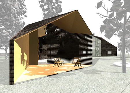
A room with only three external walls sits at the rear of the house and is open to the garden.

The project is due for construction later this year.

The following information is from the architect:


Villa is situated in an old fishermen village near Tallinn in Viimsi peninsula.

The shape has been derived from sea side stack of boulders.

More firm and traditional facade is exposed to the street.

The courtyard is more expressive,wild, opened, communicating.

The master key of the plan solution is the butterfly tie shaped main axes of the winter garden.

It is surrounded by the rooms which compose traditional Estonian home- living room, kitchen, bedrooms, guest room, study, sauna.

The external walls and roof use tarres larch shingles.

Southern wall is of white concrete.

The wooden surfaces in the yard maily consists of untreated laurch.

Project Information

Designed: October 2008
Construction: November 2010
Site area: 1694m²
Net area: 300m²

Materials: white concrete, larch shingle, pine boarding
Architects team: Urmas Muru, Peeter Pere, Janek Maat, Doris orasi
Location: Tallinn, Estonia

Click for larger image

Click for larger image


Posted by 살구ISUE
DIARY2010. 4. 16. 10:17

건축과에서 시험기간이란... 일종의 방학이다.
시험 내용은 평소 작업과 많은 부분이 연관되며 대부분 많은 분량의 암기를 요하는 시험이 아닌 서술형 시험이고,
시험기간 동안 [설계수업]을 하지 않기 때문에 거의 해방된 느낌이 든다.
이번에 치는 시험은 [현대건축론][건축설비계획][서양문명사], 그리고 레폿으로 대체하는 [건축구조역학].

더욱이 이번엔 최고의 시험 시간 배치와 거의 전무한 설계 과제로 인해 진정한 휴식기간이 될 것 같다.
시험은 총 3과목. 월, 화, 수에 시간은 오후 5시, 4시, 4시. 설계과제는 마스터플랜에서 설계할 부지 팀별 선정하기가 전부!
남아있는 목, 금, 토, 일은 .. 자유다!!

행복하다.

'DIARY' 카테고리의 다른 글

최종발표..  (0) 2010.06.13
건축하기 싫다.  (0) 2010.05.15
설계 중간발표 완료. 팀 작업에 대한 생각.  (0) 2010.04.16
일정  (0) 2010.03.28
프로그램 아이디어 리젝...  (0) 2010.03.23
Posted by 살구ISUE
DIARY2010. 4. 16. 10:06

한 번도 배운 적 없는 마스터플랜.
도시 재생을 기본으로 한 영도 중 창고부지 마스터플랜 짜기.
처음부터 막막했다. 커봤자 넓은 부지의 건축에 대해 생각하던 내가 마스터플랜을 짜야하다니.
건축적 사고와 도시적 사고는 많은 차이가 있다. 하지만 난 무엇이 다른지 알 수 없었다.

그리고 나는 처음부터 알고 있었다. 내 자신이 얼마나 팀 작업에 적합하지 않은 사람인지.
나는 승부욕은 없지만, 나 스스로가 잘 하고자 하는 욕심은 많다. 난 자기성찰적 사람이다.
가끔은 심히 자학적이기까지 하다.

2인 1조의 설계팀 3팀이 모여 하나의 마스터플랜을 위한 팀원은 6명. 조장은 없다. 다들 같은 크기의 권리와 의무를 가지고 있다.
하지만 솔직히 개인적으로 말하자면, 팀원 2명이서 하는 것과 팀원 6명이서 하는 것의 차이는 크게 없었을 것 같다.
개인마다 생각이 다르고, 작업하는 스타일이 다르고, 작업하는 시간도 다르고, 표현도 달랐다.

나는 최대한 타이트하게 작업하고 나만의 여유 시간을 즐기는 스타일이다. (그래서 팀 작업은 정말 스트레스 팍팍~)
나는 생각을 오래 한다. 노트에 아이디어부터 어떻게 작업을 할 것인지 까지 다 적고 그려놓고 나서
실제로 '작업'이라 부르는 것은 그것을 보면서 되도록 빠르게 끝내 버린다.

생각은 주로 틈의 시간을 이용한다. 아침에 학교에 가는 길에 지하철에서 하고,
점심 먹고 쉴 때, 가끔은 수업 중에 아이디어가 생각나면 노트에 적고, 밤에 잠들기 전에 한 번쯤 생각해보고. 대충 그렇다.
그리고 작업은 저녁에 한다. 학교에서 돌아온 뒤 1시간 쯤 쉬고 작업을 시작한다.
새벽 1~2시가 되면 작업이 남아 있더라도 자거나 영화나 책을 본다. 작업은 다음 날 하면 되니까.
하지만 많은 사람들이 천천히, 주로 밤과 새벽에 작업을 하고, 마감 시간 전에 끝내면 된다는 생각을 하는 것 같다.

아무튼 다 달랐다.
그 속에서 하나의 마스터플랜을 짜기란 쉽지 않았다.
특히 우리 팀은 다른 팀보다도 다들 의견 표현이 소극적이었기 때문에 더 힘들었던 것 같다.
다른 팀은 다들 하고 싶은 것이 많고 말이 많아서 의견 조율을 위해 티격태격 토론을 벌이는데,
우리 팀은 침묵 속에 다들 무엇을 생각하는지 알 수 없었다.
더욱이 그 2주 동안은 내가 건축을 배우기 시작한 이래 건축에 대한 생각과 과제 작업을 가장 적게 한 시간이었다고 생각한다.

그렇게 시간은 자꾸만 흐르고 우리 팀은 이 설계 분반에서 가장 뒤쳐지는 팀이 되어 있었다.
난 그 상황을 참을 수 없었고(물론 다른 팀원들도 마찬가지였을 거다.), 
나 혼자 마스터플랜을 짠다고 생각하되 이전에 들었던 팀원의 의견을 반영하여 내용을 발전시키고 표현할 포맷을 짜고 그랬다.
그 다음, "이게 마음에 들어요? 생각이 잘 반영된 것 같아요?"라고 물었다. 물론 이견이 있을 땐 반영하여 수정했다.
독선적인 걸 알지만 그렇게 했다. 기존의 방식대로 하다간 정말 낙제라도 할 것 같은 상태으니까.

더 좋은 의견 조율과 발전 방법을 생각하지 못 한 것에 대해서는 유감스럽게 생각한다. 
포토샵 작업은 분량을 정하고 개인에게 분배해 작업했다. 물론 개인의 건강이나 사정에 의해 조금씩 조율은 있었다.
그 뒤, 하나로 합치는 작업을 해야했다.

그런 식으로 우리 팀은 약 2주의 뒤처짐을 지난 1주일동안 따라잡기 위해 발버둥쳤다.
우리가 다른 팀을 따라잡기 위해 노력하는 사이 다른 팀은 작업을 더 발전시키고 있었다.
그래서 그들보다 더욱 많은 시간을 잠들기를 포기하고 작업했다.

나는 어서 끝내고 설계를 하고 싶었다.
우리가 발전시킨 내용이 너무 적고 정리가 안 되 있어서 교수님께 발전적이지 않은 크리틱을 받는 건 정말로 싫었다.
내가 받고 싶은 크리틱은 내가 열심히 생각과 작업을 해가서 교수님이 내가 한 것을 보완해주고 수정 및 발전을 위한 크리틱을 해주는 것이지, 내가 해 간 것 자체가 부족해서 다시 앞으로 돌아가서 처음부터 수정해야되는 짓은 정말로 싫다.
(하지만 가끔은 열심히 했는데도 그 사이에 모순이 생겨서 돌아가기도 한다. 후.)
대부분의 사람은 그 상황이 싫을 것이다. 그렇다면 열심히 해여하지 않겠는가? 아니면 그걸 극복할 번뜩이는 아이디어가 있든지. 작업물 자체의 질은 조금 떨어지더라도 그 생각자체가 발전되어 있으면 보통 교수님들은 크게 간섭하지 않는다.(고 생각한다.)

정말 이렇게 넋두리를 심하게 하는 사람이 아닌데, 이번엔 정말 좀 힘들었다.
김덕모 교수님 수업을 할 때도 바쁘긴했지만 나름의 재미와 즐거움이 있었는데,
이번 마스터플랜 작업은 대체적으로 그냥 힘들고 갑갑했던 작업이었다.

사람들과의 관계에 대한 부분은 내가 가장 힘들어가는 삶의 부분 중 하나이다.
나는 사람들과 잘 어울리지 못 한다. 나는 혼자인 것에 익숙하고, 아주 소수의 사람과 어울리는 것에 편안함을 느낀다.
나는 타인에 대한 궁금증보다 나 자신에 대한 궁금증이 더 많다. 나도 아직 나를 잘 이해하지 못 하고 있고, 나의 성격과 태도에는 많은 모순이 존재한다. 그런데 어떻게 남을 이해할 수 있겠나 싶다. 나는 남을 배려할 줄은 알지만, 남을 이해하진 못 한다.
하지만 사람들과 잘 어울리고 싶다. 하지만 어떻게 해야 할 지 모르겠다. 형제라도 있었면 더 잘 알 수 있었을까?

생각은 많지만 정리가 잘 안 되는 것이 팀작업을 통해 여러 사람과 서로의 생각을 공유하면서 같이 발전해갈 수 있을거라고 생각했던 나의 기대는 거의 산산히 부서졌다. 그래도 다른 사람들이 한 상황에서 어떤 식으로 나와는 다르게 받아들이고 생각하는지에 대해서 알 수 있었던 성과는 있었다. 나와 남은 정말로 다르다. 정말로.
설계는 2인 1조인데, 그때는 더 재미있기를 다시 기대해본다. 나의 삶은 개인적 흥미 추구를 위해 존재한다.
재미있게 살자!!

'DIARY' 카테고리의 다른 글

건축하기 싫다.  (0) 2010.05.15
시험기간.  (0) 2010.04.16
일정  (0) 2010.03.28
프로그램 아이디어 리젝...  (0) 2010.03.23
건축가와 이미지. 그리고 몸값.(?)  (0) 2010.03.19
Posted by 살구ISUE
ARCHI./NEWS2010. 4. 16. 09:23

Swarovski Crystal Palace 2010 April 15th, 2010

Milan 2010: Swarovski Crystal Palace present installations by designers including Tokujin Yoshioka, Yves Behar and Gwenael Nicolas in Milan this week.
Top: Yves Behar
Above: Tokujin Yoshioka

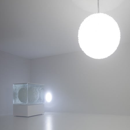
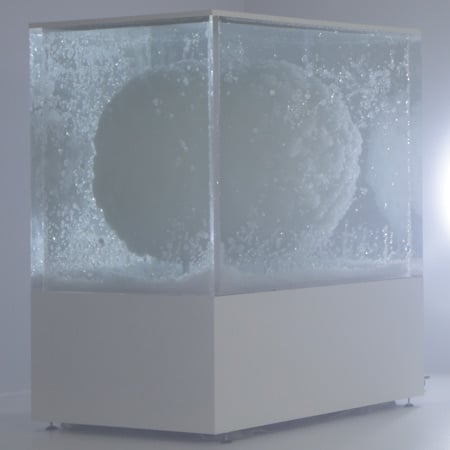
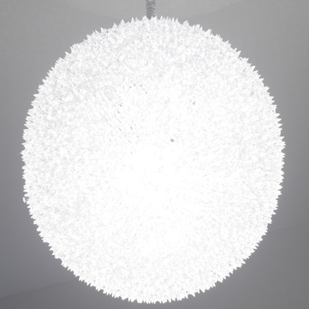
Yoshioka presents an LED light covered in 10,000 Swarovski crystals alongside a second globe growing inside a tank (see our earlier story about Yoshioka’s Venus project).
Above: Tokujin Yoshioka

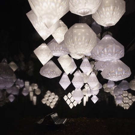
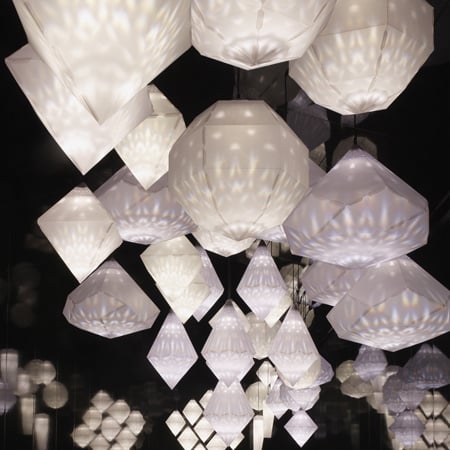
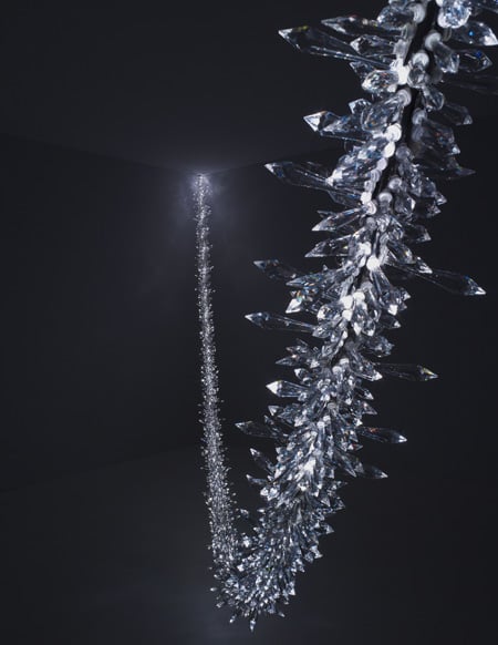
Nicolas has strung crystals through the space and captured them inside balloons, while Behar’s project uses a crystal to refract light onto paper lanterns.
Above: Tokujin Yoshioka

Swarovski also present a collection of furniture in Milan – see our earlier story.
See all our stories about Milan 2010 in our special category.
Above: Yves Behar

The information below is from Swarovski Crystal Palace:


Swarovski Crystal Palace 2010 launched new works by five international designers in a ground-breaking exhibition that took visitors on an experiential journey at the Salone del Mobile 2010.
Above: Vincent Van Duysen

In 2010 Swarovski Crystal Palace presented yet another exhilarating and inspiring series of commissions, demonstrating the creative potential of Swarovski crystal and the artistic expression of each designer’s work.
Above: Vincent Van Duysen

Swarovski Crystal Palace commissioned five international designers to interpret the beauty of Swarovski crystal and incorporate their vision into a piece of design. Tokujin Yoshioka from Tokyo, French-born, Tokyo-based Gwenaël Nicolas, Belgian architect Vincent van Duysen, Dutch architectural lighting designer Rogier van der Heide and Swiss-born, San-Francisco-based designer Yves Béhar each created strikingly different concepts.
Above: Gwenael Nicolas

“Swarovski Crystal Palace is Swarovski’s think tank, a platform for creative expression and experimentation with innovation and technology,” Nadja Swarovski, Vice President of International Communications at Swarovski, comments. “Our designer collaborations not only push the boundaries of the designers’ own work but also of the use of Swarovski crystal in an artistic, decorative and functional way.”
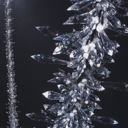
Above: Gwenael Nicolas

The Swarovski Crystal Palace exhibition, an incubator for cutting edge design, demonstrated the merging of art, design, science and technology. Each designer’s creative expression was captured in single room installations, captivating the imagination of each visitor. The final designs were a combination of sculptural pieces, art objects, or works which had a decidedly architectural quality. The exhibition brought on board Jules Wright, founder of the The Wapping Project in London and a background in theatre, who created a mise-en-scène that brought dramatic life to the different designers’ works.
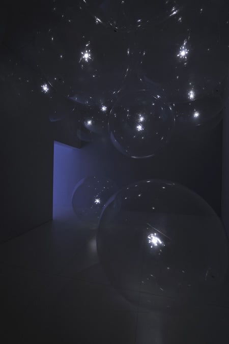
Above: Gwenael Nicolas

The guiding theme was inspired by the idea of inspirational palaces – from Versailles with its hall of mirrors, to Japan with its Zen aesthetic, to the Winter Palace in St Petersburg. Each design was showcased in a separate room, allowing the designers the opportunity for creative expression. “Every space focused the eyes on the specific object and the environments contextualised each piece in a theatrical way,” Wright explained.
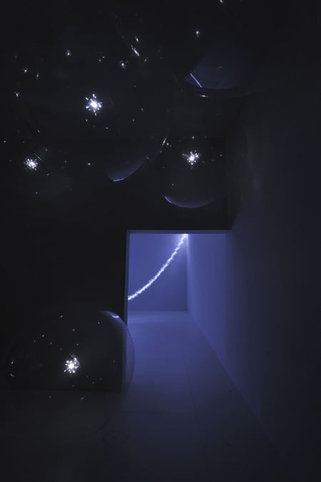
Above: Gwenael Nicolas

As visitors moved through the exhibition, they engaged in a journey through the different worlds and environments conjured by the designs. The journey culminated in a final room celebrating some of the staggeringly inventive concepts created by the world’s most innovative designers for Swarovski Crystal Palace over the last 8 years. “We were delighted to have Jules Wright’s involvement this year in curating the show. Her concepts have enhanced the meaning of each piece, each design,” Nadja Swarovski commented.
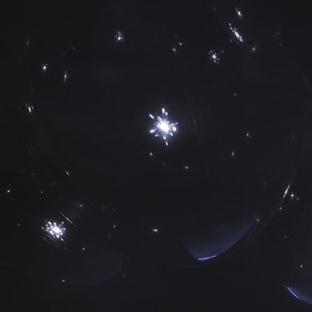
Above: Gwenael Nicolas

STELLAR by Tokujin Yoshioka

Visitors entered the exhibition through a room dedicated to Tokujin Yoshioka’s design. For Swarovski Crystal Palace he created an installation, which consisted of a 1 metre diameter globe encrusted with 10,000 Swarovski crystals and lit from within by 600 LEDs. An accompanying piece featured another globe suspended in a vast tank of water, on which crystals grew naturally. The design was an evolution of Yoshioka’s 2008 work entitled “VENUS – Natural crystal chair” in which the chair – like Venus – emerged from the ‘water’ as the crystals naturally grew on its frame.

“What is important to me is not just designing another sculpture with crystal, but to create a star which shines in the viewer’s heart,” Yoshioka explained. His approach was to, “incorporate the element of beauty born of coincidence,” into his piece, adding that, “it was technically challenging because the unpredictable element found in nature had to be accurately expressed by human design.”
Above: Rogier Van Der Heide

SPARKS by Gwenaël Nicolas

“I wanted to imagine a space with no gravity,” Gwenaël Nicolas comments on his project, which consisted of two separate designs. The first item was almost, “not an object anymore, where crystal and light become life.” Nicolas created large, free-floating, transparent balloons filled with helium, in which floated a small crystal sculptures lit by a battery powered LED inside. The balloons, which measured 2.4m in diameter, drew on NASA technology to enable them to be as thin and transparent as possible. The LED light emanating through the crystal within set off a series of ’sparks’ which moved as the balloons and crystals gently floated through the room.

A separate design consisted of a 10m long string of crystals incorporating LED lighting that was programmed to set off more ’sparks’ which jumped along the length of the rope.
Above: Rogier Van Der Heide

FROST by Vincent Van Duysen

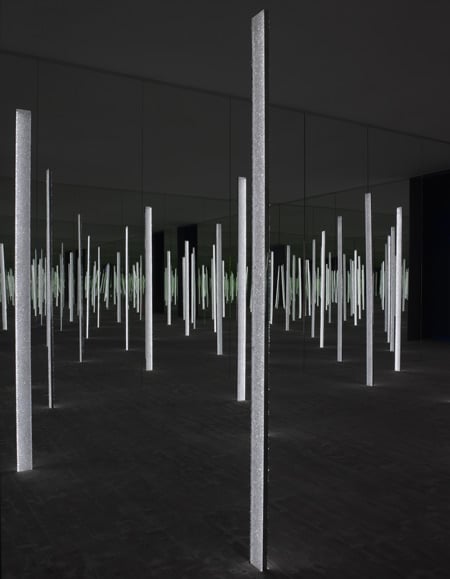
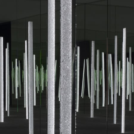
Vincent van Duysen created a highly versatile glowing ‘beam’ encrusted with Swarovski crystals. The design could be used on its own – suspended above a table for example or leant against the corner of a room, or joined together as modular elements to create dramatic architectural shapes. The elements came in three different widths – from 6cm to 16cm, and three different lengths, from 140cm to 220cm. The surface of each bar featured a ‘crust’ of randomly assorted, different sized crystals set into resin. Sandwiched between the crystal exteriors was a thin glass panel which gave the ‘beams’ their structure and rigidity while also acting as a vehicle for the LED lighting within. Van Duysen commented on the way in which Swarovski crystals brought out an element of playfulness in the design process; “They remind you of natural elements like water and ice, and allow you to bring in more poetic and emotional aspects to lighting design.” He also commented on the pleasingly contradictory nature of the crystals used in this design, with the outer ‘crust’ having a temptingly tactile quality while actually being surprisingly rough to the touch.

DREAM CLOUD by Rogier van der Heide

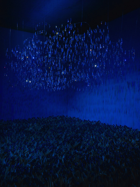
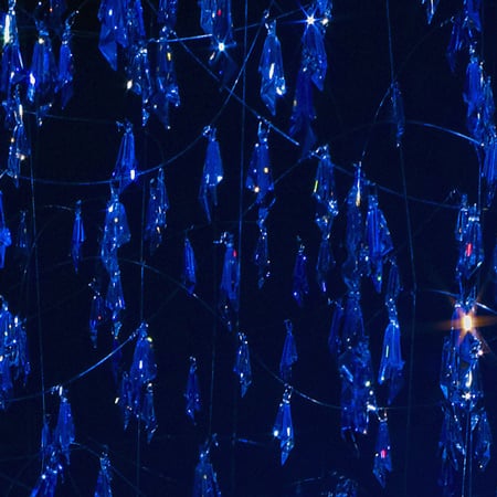
This installation was an interpretation of the crystals’ purest, most intrisic features: how they spark our imagination. The installation relied on the beauty of the crystals and had the magic of the Northern Lights.

Rogier Van der Heide comments: “I presented Swarovski Crystal Palace in Milan as a dreamy cloud of crystals, a three-dimensional sculpture that expressed the natural, magical, imaginative and beautiful.” ‘Dream Cloud’ consisted of thousands of pure crystals floating in the air, transforming the space into a captivating sculpture that relies on the reflective properties of the crystals against the blackened walls. An external source of light illuminated the cloud of crystals with a changing spectrum of colours. A body of black tulips carpeted the floor which provided a dramatic setting.

AMPLIFY by Yves Béhar

Yves Béhar combined the possibilities of technology with the inherent qualities of Swarovski crystal to create a beautiful yet surprisingly affordable lighting arrangement, which consisted of a series of deceptively simple ‘paper lanterns’ shaped like crystals, within which light was refracted from a real crystal, casting its patterns on the surface of the paper.

Béhar’s design was created with a focus on sustainability and affordability, featuring a faceted shade made from recyclable materials, one crystal and one low-energy consuming LED light. The design featured 6 different crystalline shapes in varying sizes, which could either be used individually or clustered together to create a striking effect.

Posted by 살구ISUE
ARCHI./NEWS2010. 4. 13. 14:21
April 13th, 2010


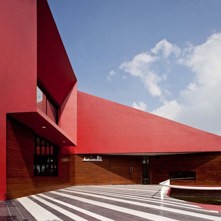
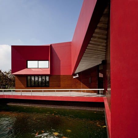
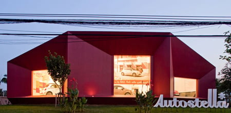
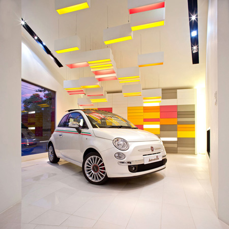
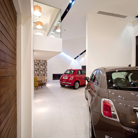
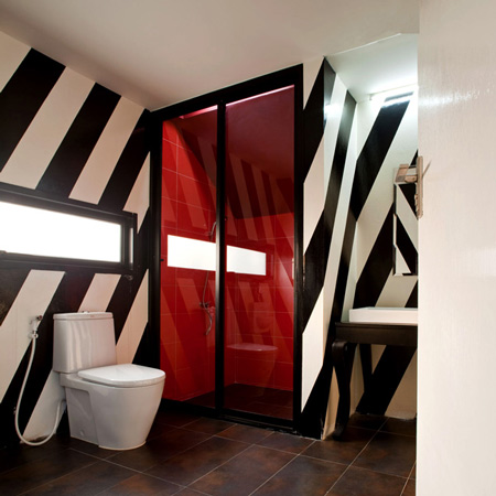
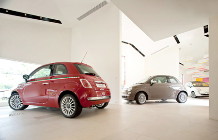
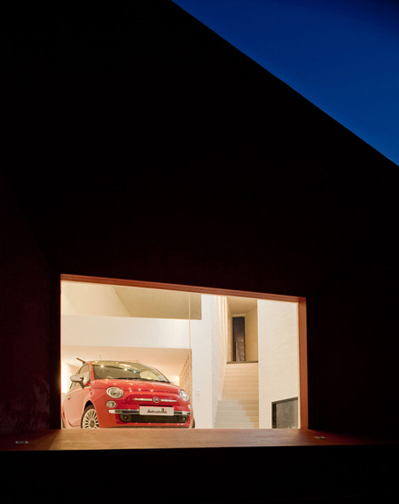
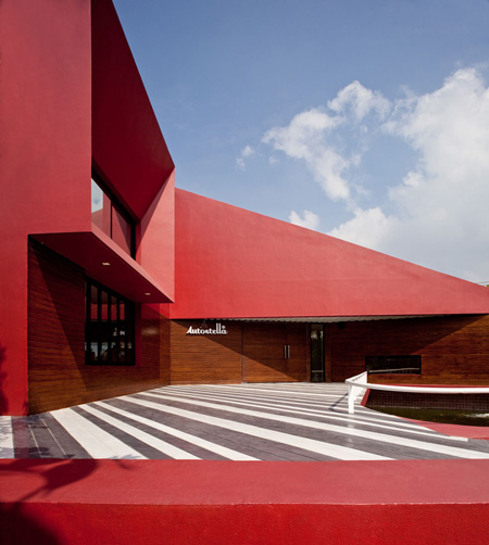
태국의  Supermachine Studio 건축가 그룹에서 방곡에 밝은 붉은 빛의 차 쇼룸을 완공하였다.

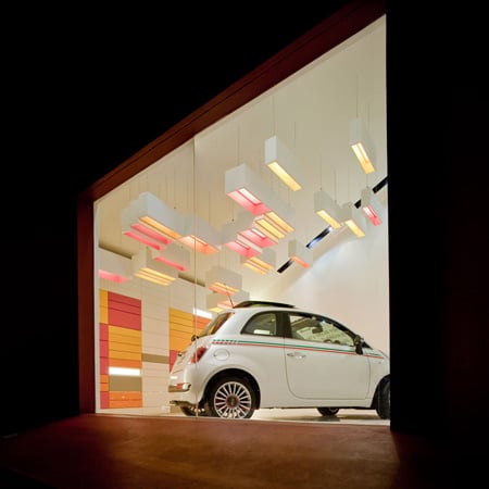
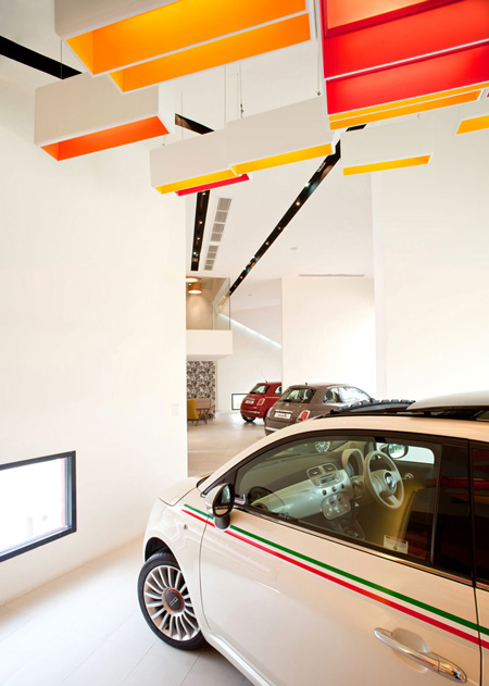
산뜻하게 내부를 돋보이게 하는 조명 디자인! 마음에 든다.

도로를 향해 각각 다른 크기의 창이 나 있는4개의 다르게 연결된 룸들을 가진 '오토스텔라 Autostella'.

Photographs are by Wison Tungtunya.

The information below is from the architects:


Autostella showroom, Bangkok

From early period of the last century, automotive industry seems to have always influenced the of architecture (but not so much the other way around.) In the modern history, different aspects of “automobile” has been inspiring architecture, whether as a material, shape, speed of the way cars are manufactured.

We have learned so much from the classic examples like Fiat’s Lingotto factory in Turin, (Mattè Trucco 1923) that has a test track on the roof top or BMW’s Central Factory in Leipzig (Zaha Hadid, 2005) that incorporates the process of car production and architecture into one.

Car is another architecture’s best friend.

Autostella is a small imported car showroom in Bangkok located around Eakamai-Ramintra expressway.

The types of cars Autostella keen to sell are those cute car and fun to drive like Fiat 500 or some other small models of another Italian car maker, Alfa romeo. Autostella is not an automobile showroom with super high glass windows as commonly seen in Thailand.

We accessed the project by neglecting the stereotype aspect of automobile that people connect themselves with which is “speed” and its “Dynamic” look. But it is designed like a small bakery and cafe’ that has small car parks right in the middle of the shops.

Their potential clients are those lifestyle concerned people (who sometimes emotional buy rather than logical buy things.)

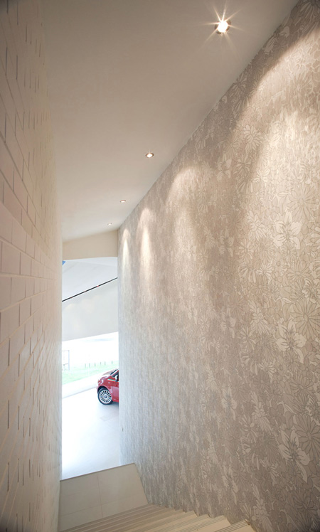
The flat and long red box is pushed-pulled deformed and divided in to 4 different (but connected) rooms. Each room has windows in different sizes facing the street.
Each of the window is different size according to the size of the room. The room can be decorated differently in the future to suit the mood of the new models of the cars coming-in in the future. “Why the car showroom has to be single white room with non-differentiation all the time? It’s so boring.”
'ARCHI. > NEWS' 카테고리의 다른 글

Liiva House by Muru & Pere  (2) 2010.04.16
Swarovski Crystal Palace 2010  (0) 2010.04.16
프랭크 게리와의 대화(In Conversation with Frank Gehry)  (1) 2010.04.06
Restello by Piercy Conner Architects  (1) 2010.04.04
Grotto by Callum Morton  (1) 2010.03.28
Posted by 살구ISUE
ARCHI./INFOR.2010. 4. 11. 14:04

리즈/Leeds

 
도시명 리즈/Leeds
위치 유럽/영국
인구/면적 723,100인(2005)/551.72㎢
테마 산업.물류
웹사이트 http://www.leeds.gov.uk/


김복환 l 리즈대학교 지리학과 박사과정
도시모델링으로 저명한 미국의 클라크(Keith Clarke) 교수는 인간에 의하여 유발되는 토지의 형태변화 중 가장 주요한 원인이 ‘도시화(urbanization)’라고 하였다. 한때 서울 잠실(蠶室)에서 어린시절을 보냈다던 대학교 동창이 당시의 잠실은 뽕나무 밭이었다고 하였던 기억이 난다. 지금의 잠실과 비교한다면 클라크 교수의 주장에 동의하지 않을 수 없다. 이러한 도시화는 세계적인 추세라고 할 수 있다. 2002년 유엔의 인구통계 예측에 따르면 2000년부터 2030년까지의 인구증가는 61억 명에서 83억 명으로 약 22억 명이 늘어날 것이라고 했고, 같은 기간의 도시인구는 29억 명에서 50억 명으로 21억 명이 늘어날 것이라고 하니, 앞으로 태어나는 모든 아이들은 거의 대부분 도시에서 태어날 것이라는 이상한 해석(물론 농촌인구의 도시 유입을 포함하지만)도 가능하다.

영국 중심에 위치한 리즈는 교통망이 잘 발달되어 있다 도시의 발달은 인간의 문명발달과 밀접한 관계를 지니며, 학자들에 따라 그 기원을 BC 9500년 전의 터키 아나톨리아라고도 하고, BC 3000년 전의 메소포타미아나 나일강유역 등이라고도 한다.

그러나 인간의 삶이 도시적 생활방식의 굴레에 강하게 구속되기 시작한 것은 18세기 초 영국에서 비롯된 근대산업도시의 등장부터라고 할 수 있다. 당시 도시성장은 산업혁명에 의해 촉발된 도시지역의 노동력에 대한 수요가 2차 인클로저 운동에 의해 농토에서 분리된 농민들을 스폰지처럼 흡수하면서 급속히 진행되었다.

그러나 이러한 근대산업도시의 대부분을 구성했던 공장노동자들은 값싼 노동의 대가에 의존하여 살아야 했다. 공중위생법(1848), 공장법(1833~1901), 도시계획법(1909) 등 당시로서는 개혁적인 조치로 약간씩 나아지기는 했지만, 인프라문제, 환경과 교통문제, 소수인종문제, 계층간의 불평등문제 등은 여전히 도시에 사는 공동체들이 풀어야 하는 난제들로 남아 있다.

이상한 것은 인간의 필요에 의해 도시가 창조되었음에도 불구하고, 인간은 이러한 도시가 만들어 내는 거대한 질서 또는 무질서(불편함)에 지배되어 이러한 도시시스템에 적응하거나 인내하고 살아야 하는 역구조가 탄생하였다는 것이다. 도시가 만들어 내는 이러한 문제점들에 대한 인식은 자연스럽게 도시가 왜 성장하는가? 어떤 도시가 성장하고 어떤 도시는 쇠퇴하는가?

어떻게 하면 도시 속에 살고 있는 인간의 삶이 개선되거나 더 이상 나빠지지 않도록 - 요즘은‘지속가능한’이란 표현으로 함축된다 유지될 수 있는지 등에 대한 의문을 지속하여 왔다. 물론 지난 100여 년간 이러한 의문에 대해 많은 이론적인 연구(1)가 진행되어 왔었다. 그러나 우리는 여기서 이러한 딱딱하고 어려운 이론들을 설명하지는 않을 것이다. 차라리 이보다는 산업혁명의 중심에 있었던 리즈라는도시를 놓고 이 도시가 근대산업도시로 성장해온 과정과 그 속에서의 도시문제, 이를 극복하기 위한 노력, 그리고 현재의 모습 등을 시간의 흐름에 따라 살펴봄으로써, 이들이 가꾸어 내려고 했던 도시의 모습과 그 가운데 있었던 인간의 역할을 이해하는 것이 흥미로울 것이다.

리즈시내 서북쪽의 모습많은 서민들이 이용하고 있는 리즈의 기차역 모습
1. 리즈의 지리학적 위치와 일반현황
리즈는 지리학적으로 영국의 중심부에 위치한 도시다. 리즈에서 스코틀랜드의 수도인 에딘버러까지가 북쪽으로 약 360km(200마일)이고, 남쪽으로 같은 거리에 잉글랜드의 수도인 런던이 위치하고 있다. 리즈는 또한 영국교통의 중심지다. 런던에서 시작하여 영국의 남과 북을 연결하는 주 간선도로인 M1 고속도로의 종착지이며, 영국을 동서 헐(Hull)에서 리버풀(Liverpool)까지로 연결하는 M62의 중간에 위치하고 있다. 리즈의 시내중심에서 시작하는 M621 고속도로를 타고 5분이면 이 두 고속도로와 만나므로, 리즈는 교통의 요지임에 틀림없다. 리즈의 면적은 562km2이며, 2001년 현재 인구는 71만 7천 명으로서 크기는 우리의 대전만하고(540km2) 인구는 대전의(140만 명)의 절반 정도 수준이다. 인구를 기준으로 본다면 영국에서 런던(London)과 버밍엄(Birmingham) 다음으로 큰 대도시다. 1998년의 지역총생산량(GDP)은 약 19조 원이며, 1인당 GDP는 약 2,600만 원으로서, 경제규모로도 런던과 버밍햄 다음의 도시다.
2. 리즈의 성장역사
비록 리즈의 역사는 중세의 장원으로 거슬러 올라갈 수 있다고 하더라도, 본격적인 도시발전의 역사는 18세기부터다. 당시 리즈는 직물의 교역도시였다. 리즈에 직물산업이 발전한 원인으로는 우선 양들을 키울 수 있는 완만한 구릉의 목초지가 많았고, 이러한 양모를 세탁할 수 있는 물이 있었다. 또한, 양모를 나를 수 있는 교통수단이 있었는데 그것은 운하였다. 운하는 당시 낙후된 도로시설을 대신하고 적은 노동력으로 많은 화물을 운반할 수 있어(2) 전국적으로 발전하였는데 리즈는 에어(Aire)강이 중심에 있어 영국 동쪽의 항구인 헐과 운하로 연결되어 있었다. 직물거래를 위한 시장의 설립은 이 에어강 위의 다리에서 시작되었는데, 교역이 점차 확대됨에 따라 18세기 중반에는 강 북쪽의 브리게이트(Briggate)와 콜(Call), 그 오른쪽의 커게이트(Kirkgate) 등으로 시장이 확대되었다.

18세기가 리즈라는 도시의 태동이라면 19세기의 리즈는 산업혁명으로 대표될 수 있다. 도심지는 공장과 공장노동자들의 주거지로 더욱 과밀화되었다. 부자들은 도심에서 탈출하여 외곽으로 빠져나감으로써 도시가 급속히 팽창하였고, 이로 인하여 토지이용의 분화가 나타나고 고착되어 갔다. 19세기가 시작되면서 리즈의 직물산업은 점차 쇠퇴하기 시작하였으나, 인구의 감소를 겪는 다른 도시와 달리 리즈는 기계, 군수물품과 의류산업, 출판기계산업이 번성하기 시작하였고, 이들을 대상으로 하는 은행이 설립(1813년)되고 상점이 생겨나면서 인구는 여전히 증가세를 보였다. 이러한 인구증가는 공장이 밀집한 도심의 모습을 변화시키기 시작하였는데 우선, 시내에 상업시설이 선을 보이기 시작한다. 보어래인(Boar lane)에는 1867년에 쇼핑센터가 들어섰다. 노동자들의 주거지역은 도심의 동쪽인 동커게이트(East Kirkgate)나 도심의 서쪽인 웰링톤(Wellington), 홀백(Holbeck)쪽, 에어강 남쪽의 헌슬렛(Hunslet)으로 급속히 번져나갔으나, 이들의 삶은 극도로 절망적인 수준이었다. 그들은 열악한 근로환경과 지저분한 주거환경, 심각한 공해 속에서 제 수명을 다 채우지 못하고 죽어갔는데 1750년 영국남자의 평균수명이 31살, 여자의 평균수명은 33살이었다고 한다.

1950년대까지만 해도 도심에 자리잡고 있었던 도시빈민 주거지 당시 급격히 늘어난 공장은 에어강 남쪽의 헌슬렛, 시내 중심에서 서쪽인 홀백, 커크스톨(Kirkstall)과 시내 동쪽으로 요크로드(York road)를 따라 확대되어 갔으며, 이들이 내뿜는 연기는 북동방향으로 부는 바람을 타고 시내전역에 검은 분진을 날렸다.

이에 성공한 상인들이나 공장주들은 보다 깨끗한 환경을 찾아 유일한 탈출구인 북쪽 또는 북서쪽의 민우드(Meanwood)나 해딩리(Headingley) 등으로 이주하였고 이들 신흥 부촌과 리즈 도심을 연결하는 오틀리로드(Otley road)가 1818년에 건설된다. 현재 이 도로는 A660 도로로 불리며 리즈에서 가장 정체가 심한 도로로 유명한데, 당시 이 도로는 유료도로여서 일반노동자는 부촌으로 접근하는 것 자체도 어려웠다.

이러한 북적임 속에서도 재미있는 것은 시내 중심에 공원(열린 부지: Open space)을 조성하려고 노력했다는 것이다. 그러나 당시의 이러한 노력은 넘쳐나는 노동자들과 이들의 주택(Back to Back house)이 급속하게 확대되어 실현되지는 못했다. 지금 시내에 들어가 보면 빼곡한 건물들 주변에 잘 가꾸어진 잔디밭들이 눈에 띄는데 이러한 부지들은 20세기 도시재개발의 산물이다. 시내중심에 공원을 조성하려는 노력은 수포로 돌아갔지만, 시내를 벗어난 외곽에는 커다란 공원들이 계획되어 아직까지도 보존되고 있다.

19세기의 이러한 토지이용 분화에 큰 영향을 준 것으로는 도시교통의 발전을 들 수 있다. 처음 도시교통수단으로 등장한 것은 두 마리의 말이 끄는 마차버스로서 1840년에 부촌인 해딩리와 시내 중심간을 운행하였다. 그러나 이 버스는 요금이 비싸서 중산층들조차 이용할 수 없었으며, 1902년 전차(electrified tram)에 그 자리를 양보한다. 전차는 전기를 이용한 기술혁신으로 낮은 요금을 유지할 수 있어서 노동자들의 발이 되었고, 이는 도시의 성장에 커다란 영향을 미친다. 저렴한 요금과 많은 노동자들의 수요를 바탕으로 전차노선은 이후 확대되어 리즈의 시내교통뿐만 아니라 인근의 웨이크필드(Wakefield), 호스포스(Horthforth), 로스웰(Rothwell) 등으로 뻗어나가 도시간 교통수단으로의 역할도 담당한다.

물론 1830년대에 이미 기차가 도입되었으나, 그 연장이 짧았고 북쪽의 병풍과 같이 펼쳐진 높은 지형 때문에 크게 확대되지 못한 것과 비교하여 전차의 성공은 상당히 대조적인 성과였다. 또한 1920년에는 소규모 버스회사들 이 등장하기 시작하였으나, 북쪽의 높은 언덕을 힘겹게 오르락 내리락 하면서 전차와 경쟁하기에는 기술력이 부족하였다. 이미 탄탄하게 형성된 전차의 진입장벽에 막혀 방사선으로 구성된 전차노선의 틈새를 메꾸는 역할을 할 뿐이었다.

그러나 1930년 도로교통법(Road Traffic Act)에 의하여 작은 버스회사들이 큰 회사로 통합됨에 따라 보다 나은 장비로 전차와 경쟁이 가능하게 되었다. 이처럼 저렴한 대중교통의 등장은 도시의 외형을 급속히 변화시켰는데 우선 방사선으로 뚫린 전차선로 주변에 노동자들의 가옥이 들어서기 시작하였다. 그러나 이후 등장한 버스가 이러한 방사선의 틈새를 메워감에 따라 방사형 도시의 틈도 어느덧 중산층 도시인의 주택으로 채워졌으며, 특히 1970년 자동차가 급속히 보급됨에 따라 보다 부유한 사람들은 리즈의 유일한 탈출구였던 북쪽방향으로 보다 더 멀리 이주하여 부도심권을 형성하였다. 이들이 이주한 리즈의 북쪽지역과 북서쪽지역의 주택가격은 아직도 리즈에서 가장 높다.
3. 근대 도시재개발의 노력
리즈의 곳곳에는 공원이 잘 조성되어 있다전통과 새로움이 공존하는 Briggate의 상점

20세기 바로 전까지 이루어진 리즈의 토지이용 분화는 몇 가지로 요약될 수 있다. 우선 리즈의 도심은 상업과 시장지역으로 변모되었으며, 제조업은 도심인근의 세 지역으로 밀집되기 시작했다(운하와 기차역에 가까운 에어강 남쪽에는 중공업지역, 도심에서 2km 정도 서북쪽에 위치한 민우드와 타너리(Tannery)를 중심으로 한 염색과 의류산업, 도심 서쪽의 헌슬렛과 홀백의 경공업과 중공업지역). 이러한 공장지대 사이를 노동자들의 주택인 Back to Back house가 리즈 도심에서부터 동심원의 띠를 이루며 밀집해 있었고 조금 부유한 사람들은 파 해딩리(Far Headingley), 라운드해이(Roundhay) 등 더 외곽에 띠를 이루며 거주하였다.

도심지에 위치한 노동자들의 절박한 생활은 크게 나아지지 않았고, 가진 자와 가지지 못한 자간의 대립은 더욱 심화되었으나, 이들 노동자들을 위한 환경개선은 천천히 진전되어 갔다. 그것도 불결한 환경이 노동생산성을 감소시킨다는 사용자들의 우려가 크게 작용하였다. 사실 1909년까지는 도시계획법이 없었으므로, 노동자들의 가옥이 공장, 창고 등과 마구 섞여 있는 무질서한 도시구조의 탄생은 자연적인 것일 수밖에 없었다. 이러한 도시구조중에서 가장 문제였던 것은 역시 노동자들의 주거환경이었다. 이들의 주거는 2차대전 당시의 전쟁포로막사를 연상시키는 집단거주시설로, 내부는 2개의 방으로 구성되어 있는데 하나는 침실이고 나머지는 부엌 겸 화장실 겸 마루인 다용도 방이다. 이러한 형태의 가옥구조는 1909년까지 7만 채에 달했으며, 리즈 인구의 80% 이상이 이러한 집에서 거주했었다고 하니, 20세기 도시재개발의 노력은 당연히 이러한 불량가옥의 철거를 통한 도시빈곤층과 산업의 도심외곽 이전에서 시작된 것이 당연하다.

그러나 1900년대 초에는 당장 주택부족문제가 심각하여 이러한 도심재개발을 시행하지 못하고, 서북쪽의 민우드나 남쪽의 미들톤(Middleton) 등의 주택공급에 치중하다가 1939년에 이르러 드디어 도심 서쪽에 위치한 3만 채의 불량주택을 철거하기 시작한다. 이곳에 거주하던 주민들은 리즈 남쪽으로 이주하였다. 이러한 계획은 쿼리 힐(Quarry Hill Flats)에 대규모 플랫의 건설로 절정에 달하는데 이는 1천 가구를 수용할 수 있는 공동주택으로 우리나라의 아파트와 비슷하다. 상수도와 하수도가 개별 호마다 공급되었고, 주변의 82%가 녹지로 조성되었으며, 병원과 상가가 단지 내에 설치되었다. 하지만 이러한 건물구조는 당시 대량의 도시빈민을 구제하기 위한 유토피아적 사상이 배경에 있었다고 하더라도 영국인들의 생활방식과는 어울리지 않음이 증명되었고 도시의 흉물로 남아 있다가 최근 철거되었다.

그러나 1950년대까지만 해도 아직도 도심에는 수많은 도시빈민의 주거지가 있었고, 이들 중 대부분은 주거조건 미달로 철거대상이었다. 1948년 총 15만 4천 채의 가옥 중 주거조건 기준미달로 철거되어야 할 집은 9만 채였다고 하니 아직도 3채 중 2채는 철거되어야 했고 이들 중 6만 채 가까이가 도시노동자의 Back to Back house였다. 2차대전 이후 리즈의 도시발전은 외부 순환도로 바깥 쪽에서 이루어졌다. 고급 개인주택이 리즈 북쪽에 건설되었으며, 동북쪽의 시크로프트(Seacroft)와 윈무어(Whinemoor)에는 산업단지와 주거단지를 포함하는 자족적인 미니 신도시가 건설되었다. 현재 이곳에는 9만 명이 거주한다.

도심에서 도시빈민주택이 점차 철거됨에 따라 시내의 재개발은 광범위하게 일어났다. 우선 시내에서 북서쪽 구릉지대에 단일의 포괄적인 계획입지가 들어섰는데 이는 리즈 의과대학의 외래병동과 리즈대학, 리즈메트로폴리탄 대학의 대학건물이 들어서고 확장되면서 교육시설 단지를 형성하게 된다. 리즈 도심부 중심상업지역의 발전은 1924년 리즈 시내를 동과 서로 잇는 중심도로의 관통에 크게 영향을 받았다. 도로 이름도 역시 중심도로와 어울리게중심되는 줄’인 헤드로(Head Row)다. 이 도로는 리즈 시내에서 보기 드물게 4차선으로 곧게 뚫린 대로다.

1960년대 이후 이 도로의 좌우로 현대식 상업과 쇼핑센터들이 들어서기 시작하는데 메리온 (Merion)센터, 세인트존스(St. Johns), 빅토리아쿼터(Victoria Quarter) 등의 쇼핑센터들이 그것이다. 시내중심에 위치한 브리게이트(Briggate)를 포함한 고전적인 올드타운거리의 내부는 전부 보행자 전용도로로 설정되어 차량통행이 금지되어 있으며, 이들 거리의 상점은 전통적인 형태와 현대적 건축물의 세련됨이 조화스럽게 공존하고 있다.

현재 리즈 도심(City centre)은 상점과 백화점, 호텔, 문화시설이 밀집되어 있으며, 이곳에서만 창출되는 고용인구는 리즈 전체의 30% 정도로 12만명에 달한다. 도시재창출의 꾸준한 노력에도 불구하고 리즈는 아직도 후기산업사회에서 나타나는 도시문제에서 자유롭지 못하다. 도심의 주변에는 저소득층을 위한 장기임대주택(Council House)이 밀집되어 있어 차량, 주택절도 등의 범죄가 극심하며, 교통문제도 심각하다. 사실 교통혼잡은 우리와 비교해 볼때 전혀 심각한 수준은 아니지만, 리즈는 벌써부터 버스전용차선, 버스우선신호제도, 버스독점차선(도로 한복판에 버스만 다니는 차선이 있다. 벽돌을 쌓아 경계를 만들어 다른 차량은 진입할 수 없다), 2인 이상 합승차량 우선통행 차선제도 등을 시행하고 있으며, 벌써부터 수퍼트램이라고 하는 경량전철을 도입하려 하고 있다.

사실 이러한 문제들보다 심각한 것은 산업혁명과 식민지개척을 통해 세계 각국에서 이주해 온 소수인종들간의 분리현상이다. 리즈에는 2001년 현재 5만 8천 명(리즈인구의 8.2%)의 소수인종이 있으며 이들 중 절반은 인도, 방글라데시, 파키스탄 등지의 중부아시아인들이고, 흑인이 1만 명, 중국인이 3,500명 등이다. 이들은 절대다수의 백인들과 비교하여 상대적으로 사회저층에 위치하고 있으며, 때로는 자신들끼리 모여 울타리를 치고 사는 분리현상과 부정적 사회문제를 만들어낸다. 몇 년 전 브라드포드(Bradford)에서 발생한 아시아계 인종의 폭동에 동조하여 리즈 북동쪽의 헤어힐(Harehill)에서 동조폭동이 있어났었고(이곳은 아시아계 인종들의 비율이 높은 지역이다), 흑인들이 주로 밀집되어 있는 도심이나 리즈대학 주변에 범죄율이 높은 것도 사실이다. 또한, 리즈의 지역간 소득불균형 문제도 심각하여 33개의 워드(Ward, 우리의 구청수준) 중 6개의 워드가 영국에서 제일 가난한 지역 10%에 포함된다.
4. 리즈를 변화시키는 힘
녹스(Knox) 교수는“도시는 인간과 이를 둘러싼 환경과의 복잡한 상호작용의 산물”이라고 설명하였다. 한 도시의 성장에는 자연적, 지리적인 환경적 특성과 더불어 이러한 환경에 직면한 인간들의 노력 등이 종합된 결정체라는 것이다. 리즈의 역사를 보면, 이들이 만들어낸 과거의 슬픈 역사와 이로부터 벗어나려는 이들의 노력이 배어 있다. 리즈는 현재 산업혁명의 근대산업도시로부터 탈바꿈하여 서비스부문이 총부가가치와 고용의 80%를 차지하는 후기산업사회의 중심적인 도시로 성장하였다.

엘빈토플러의 저서‘제3의 물결’에서는 인류의 문명이 공업혁명에서 정보혁명으로 전환되어 간다고 하였다면, 리즈의 역사는 어쩌면 이를 실증하고 있는지도 모른다. 그러나 아직도 리즈에는 풀어야할 문제들이 많이 남아 있다. 어쩌면 카우버(J.M.Cower)의“신은 자연을 만들고, 인간은 도시를 만들었다”라는 말과도 같이 도시의 본질과 변화를 이해하는 것은 자연의 그것과도 같이 복잡다기하여 단순한 논리로는 그 생리와 운동법칙을 풀어내기가 어려울 수도 있다. 앞으로 또다시 몇 십년 후에 다시 리즈를 보게 된다면 어떠한 모습을 하고 있을지 궁금하다.

http://211.187.141.176:81/2009/php/wurban/city_info_intro.php?no=126&frommain=1

'ARCHI. > INFOR.' 카테고리의 다른 글

[사라지는 근대문화유산]도시개발, 자본 아닌 문화논리로 접근  (0) 2010.04.10
도시개발의 역사  (0) 2010.04.10
DATA  (0) 2010.03.07
도심 재생(Urban regeneration)이란?  (0) 2010.03.04
그외..  (0) 2010.03.04
Posted by 살구ISUE