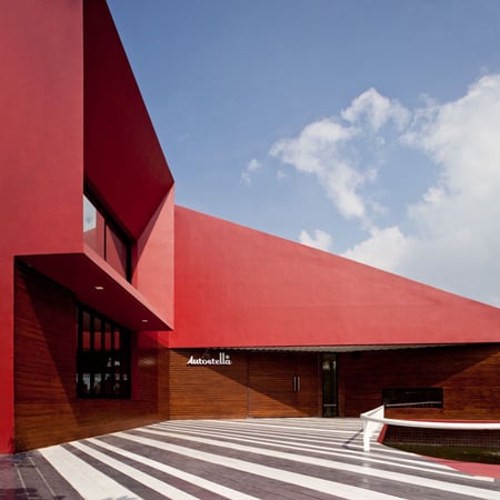
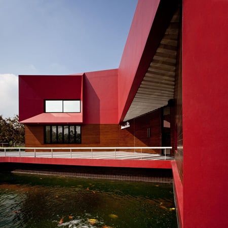
Shanghai Expo 2010: architectural photographer Iñigo Bujedo Aguirre has send us another update from Shanghai Expo 2010; this time the German Pavilion designed by architects Schmidhuber + Kaindl.

The pavilion is called “balancity” and represents “a city in balance between renewal and preservation, innovation and tradition, urbanity and nature, society and its individuals, work and recreation, and finally, between globalisation and national identity”.

All photographs are copyright Iñigo Bujedo Aguirre/View and are used with permission.

Shanghai Expo 2010 opens on 1 May; see all our stories about the Expo here. Here’s some text from the architects’ website:
Central Idea
At the german pavilion in Shanghai, the Federal Republic of Germany is presenting itself as a multifaceted nation rich in ideas. As an innovative, forward-looking country that also places great value on the preservation of its roots and heritage. Diversity and balance, rather than ’sameness’, are vital to tomorrow’s cities. The interplay between the diversity and contrasts of German cities enables a very special quality of life and vitality to emerge. This is why we believe it is essential to preserve this diversity without forgoing innovation and technology.
The Federal Republic of Germany is intent on conveying this very personal German perspective credibly and memorably. Germany’s contribution to the EXPO 2010 ‘Better City, Better Life’ theme is called: balancity a city in balance between renewal and preservation, innovation and tradition, urbanity and nature, society and its individuals, work and recreation, and finally, between globalisation and national identity. This central idea can be directly experienced by visitors everywhere in the German pavilion. Balancity a marriage of the terms ‘balance’ and ‘city’ is Germany’s interpretation of the ‘Better City, Better Life’ Expo theme.
balancity
The thinking behind balancity is clearly reflected in the pavilion architecture. A city symbolises the balance between diversity and density, and is composed of many different historical layers, spaces, functions and environments. In many cities, the industrial evolution from a production to a service orientation has led to large industrial spaces being transformed into attractive parks and residential environments.
Nature and natural landscapes re slowly but surely finding their way into the city. In contemporary European urban planning, the historically defined antipodes of city and country are now dovetailing towards a single cohesive organism. The resulting consciousness and commitment to sustainable, energy-efficient living concepts are leading to a definite integration of nature into urban spaces and architectural concepts. The architecture of the German pavilion is very much like a dynamic, urban organism, an accessible three-dimensional sculpture, mirroring the diversity of life in the city and the country in Germany.
The German pavilion as a sculpture
Four large exhibition structures stand as symbols for the interplay between carrying and being carried, between leaning on and supporting. Each individual structure, on its own, is in a somewhat precarious state of balance. It is only in interaction with the other structures that a stable balance is found. This is the concept behind balancity from an architectural perspective.
The four structures together create a large roof over the pavilion landscape, offering visitors shade and protecting them from rain. An exciting interplay of interior and exterior space, of buildings and nature, of urban and rural landscapes. The journey through the exhibition structures is set up like a promenade.
The visitors move along pathways, at times on moving walkways, as they are led through the various urban spaces. Double storeys merge with single storeys, and the slops and turns in the different spaces moderate the visitor flow.
At the end of the path, the visitor reaches a twelve-metre high, vertical amphitheatre-like room the Energy Source. Following he show in the Energy Source, the visitor is gradually led downwards in a spiral consisting of three staircases, where he finally reaches the pavilion’s event area.
Information
Project: EXPO 2010 Shanghai Deutscher Pabilion “balancity”
Overall responsibility: German Federal Ministry of Economics and Technology, Bonn
Organisation and Operation: Koelnmesse International GmbH, Cologne
Design, planning and realisation: Consortium German Pavilion Shanghai
Architecture: Schmidhuber + Kaindl GmbH, Munich
Exhibition: Milla and Partner GmbH, Stuttgart
Construction: NUSSLI (Germany), Roth
Local architect: he playze, Shanghai
Project management: BS Engineering Consulting Shanghai Co., Ltd.
Design/Construction Service: Shanghai Xiandai Architectural Design (Group) Co., Ltd.
'ARCHI. > NEWS' 카테고리의 다른 글
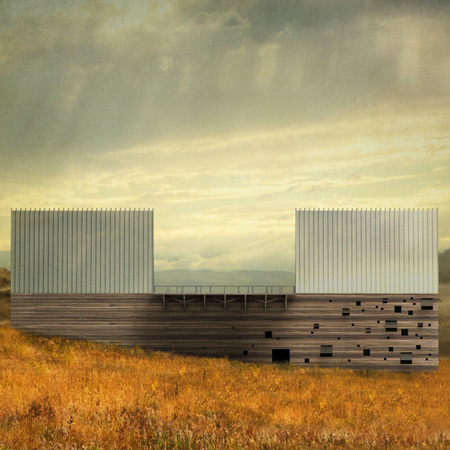
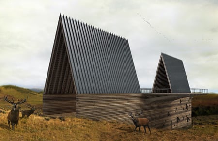
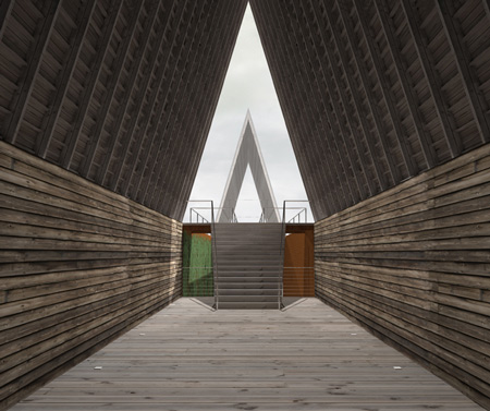
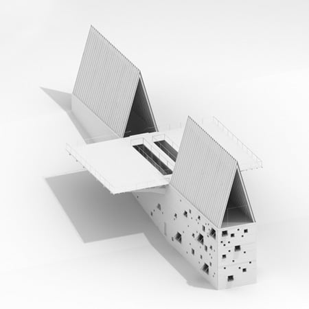
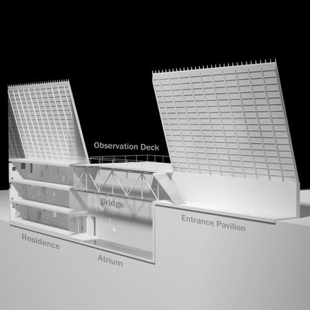
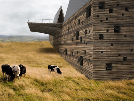
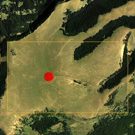
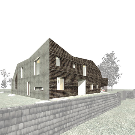
| Ark House by Axis Mundi (0) | 2010.04.24 |
|---|---|
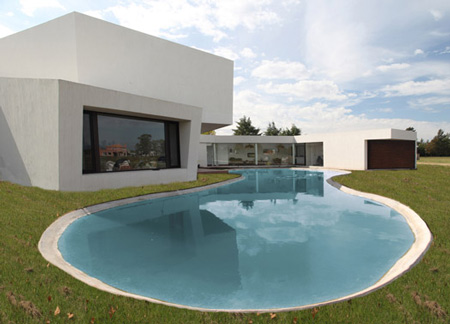
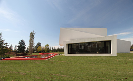
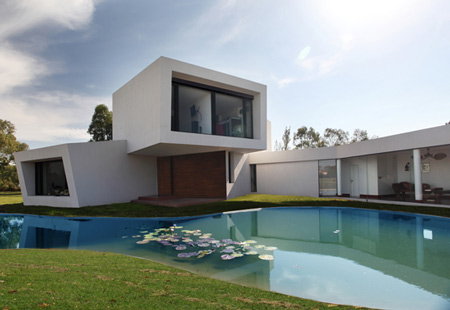
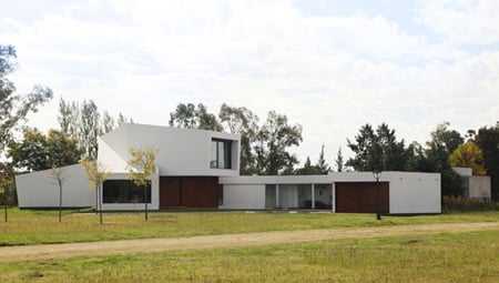
| Casa Orquidea by Andrés Remy Architects (0) | 2010.04.24 |
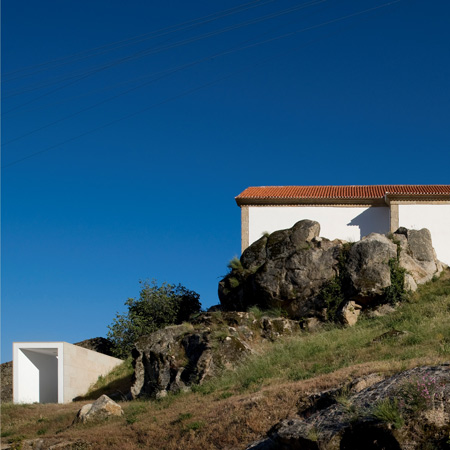
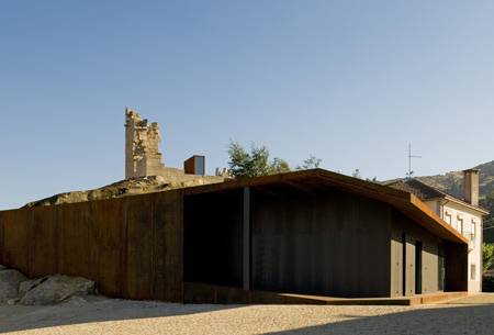
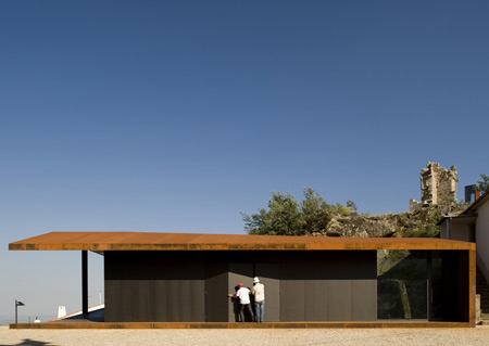
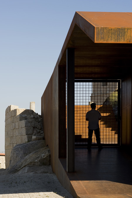
| Castelo Novo by Comoco Architects (1) | 2010.04.24 |
| Embassy of the Czech Republic (0) | 2010.04.24 |
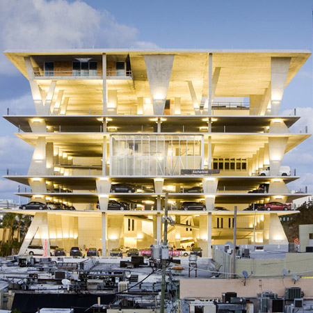
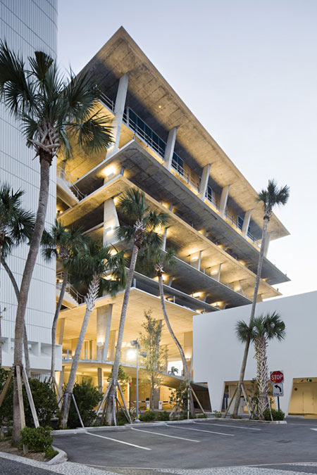
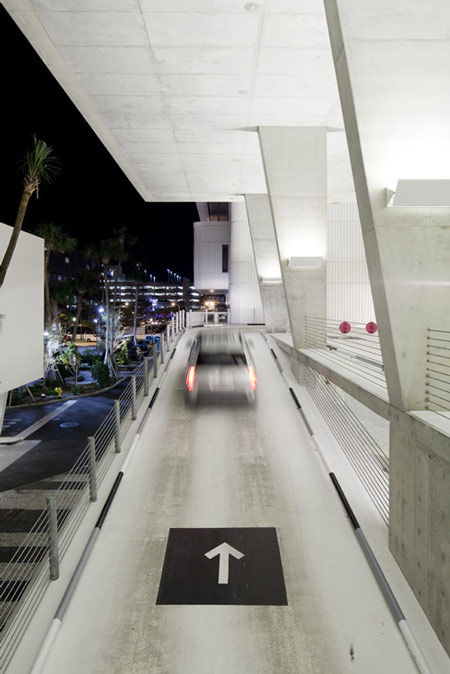
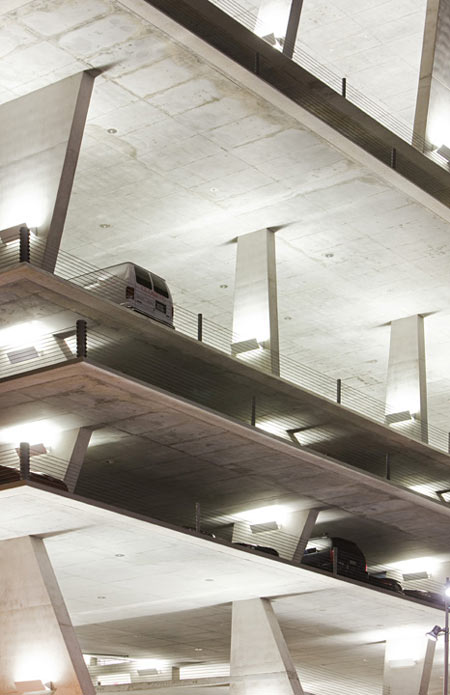
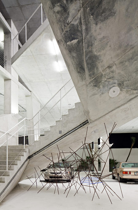
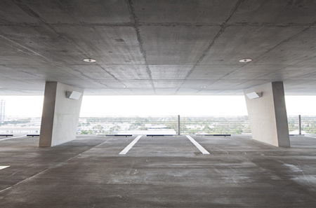
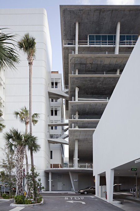
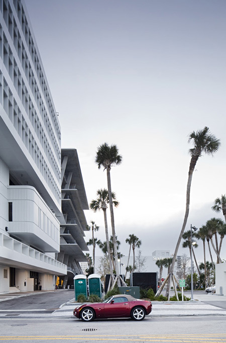
| 1111 Lincoln Road by Herzog & de Meuron (0) | 2010.04.21 |