
'ARCHI.' 카테고리의 다른 글
| 4th International Highrise Award finalists announced (0) | 2010.09.04 |
|---|---|
| Luma Park / Frank O. Gehry (0) | 2010.09.04 |
| 4th International Highrise Award finalists announced (0) | 2010.09.04 |
|---|---|
| Luma Park / Frank O. Gehry (0) | 2010.09.04 |

Burj Khalifa / Skidmore, Owings & Merrill / Dubai
The finalists of the International Highrise Award have been selected. In Frankfurt/Main an international jury of architects, engineers and property specialists chose five projects for the final shortlist. They will compete for the award and EUR 50,000 in prize money, which is bestowed by the city of Frankfurt/Main, Deutsches Architekturmuseum and DekaBank in a ceremony on 5 November 2010 in Frankfurt‘s renowned Paulskirche.
See the five finalists after the break.
Aqua Tower / Studio Gang Architects / Chicago, USA:

© gshowman via flickr: http://www.flickr.com/photos/gshowman/
Burj Khalifa / Skidmore, Owings & Merrill / Dubai:
© SOM
Mode Gakuen Cocoon Tower / Tange Associates / Tokyo, Japan:

Seen at http://www.international-highrise-award.com
The Met / WOHA Architects / Bangkok, Thailand:

© Tim Griffith
Shanghai World Financial Center / Kohn Pedersen Fox Associates / Shanghai, China:

Seen at http://www.international-highrise-award.com
| 지하철역1 (0) | 2010.09.05 |
|---|---|
| Luma Park / Frank O. Gehry (0) | 2010.09.04 |
Luma Park / Frank O. Gehry

© Patricia Parinejad
Photographer Patricia Parinejad sent us great pictures of Frank O. Gehry’s building for LUMA at the Parc des Ateliers, which was presented by The Luma Foundation at the Venice Biennale. The project will be located in the centre of Arles, France. See many more images after the break.
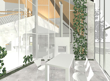
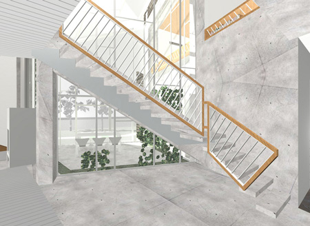
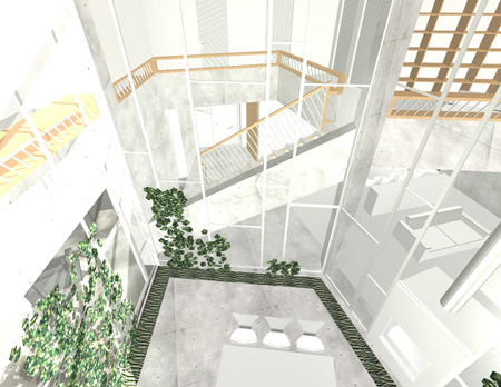
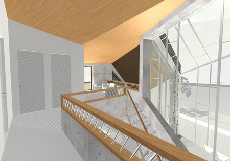
설명이 없다. 더 찾아봐야겠다. 저 괴물체의 정체를..
조감도같은 사진을 보니까, 지난 학기에 했던 창고가 생각난다.


| 지하철역1 (0) | 2010.09.05 |
|---|---|
| 4th International Highrise Award finalists announced (0) | 2010.09.04 |

Shanghai Expo 2010: architectural photographer Iñigo Bujedo Aguirre has send us another update from Shanghai Expo 2010; this time the German Pavilion designed by architects Schmidhuber + Kaindl.

The pavilion is called “balancity” and represents “a city in balance between renewal and preservation, innovation and tradition, urbanity and nature, society and its individuals, work and recreation, and finally, between globalisation and national identity”.

All photographs are copyright Iñigo Bujedo Aguirre/View and are used with permission.

Shanghai Expo 2010 opens on 1 May; see all our stories about the Expo here. Here’s some text from the architects’ website:
Central Idea
At the german pavilion in Shanghai, the Federal Republic of Germany is presenting itself as a multifaceted nation rich in ideas. As an innovative, forward-looking country that also places great value on the preservation of its roots and heritage. Diversity and balance, rather than ’sameness’, are vital to tomorrow’s cities. The interplay between the diversity and contrasts of German cities enables a very special quality of life and vitality to emerge. This is why we believe it is essential to preserve this diversity without forgoing innovation and technology.
The Federal Republic of Germany is intent on conveying this very personal German perspective credibly and memorably. Germany’s contribution to the EXPO 2010 ‘Better City, Better Life’ theme is called: balancity a city in balance between renewal and preservation, innovation and tradition, urbanity and nature, society and its individuals, work and recreation, and finally, between globalisation and national identity. This central idea can be directly experienced by visitors everywhere in the German pavilion. Balancity a marriage of the terms ‘balance’ and ‘city’ is Germany’s interpretation of the ‘Better City, Better Life’ Expo theme.
balancity
The thinking behind balancity is clearly reflected in the pavilion architecture. A city symbolises the balance between diversity and density, and is composed of many different historical layers, spaces, functions and environments. In many cities, the industrial evolution from a production to a service orientation has led to large industrial spaces being transformed into attractive parks and residential environments.
Nature and natural landscapes re slowly but surely finding their way into the city. In contemporary European urban planning, the historically defined antipodes of city and country are now dovetailing towards a single cohesive organism. The resulting consciousness and commitment to sustainable, energy-efficient living concepts are leading to a definite integration of nature into urban spaces and architectural concepts. The architecture of the German pavilion is very much like a dynamic, urban organism, an accessible three-dimensional sculpture, mirroring the diversity of life in the city and the country in Germany.
The German pavilion as a sculpture
Four large exhibition structures stand as symbols for the interplay between carrying and being carried, between leaning on and supporting. Each individual structure, on its own, is in a somewhat precarious state of balance. It is only in interaction with the other structures that a stable balance is found. This is the concept behind balancity from an architectural perspective.
The four structures together create a large roof over the pavilion landscape, offering visitors shade and protecting them from rain. An exciting interplay of interior and exterior space, of buildings and nature, of urban and rural landscapes. The journey through the exhibition structures is set up like a promenade.
The visitors move along pathways, at times on moving walkways, as they are led through the various urban spaces. Double storeys merge with single storeys, and the slops and turns in the different spaces moderate the visitor flow.
At the end of the path, the visitor reaches a twelve-metre high, vertical amphitheatre-like room the Energy Source. Following he show in the Energy Source, the visitor is gradually led downwards in a spiral consisting of three staircases, where he finally reaches the pavilion’s event area.
Information
Project: EXPO 2010 Shanghai Deutscher Pabilion “balancity”
Overall responsibility: German Federal Ministry of Economics and Technology, Bonn
Organisation and Operation: Koelnmesse International GmbH, Cologne
Design, planning and realisation: Consortium German Pavilion Shanghai
Architecture: Schmidhuber + Kaindl GmbH, Munich
Exhibition: Milla and Partner GmbH, Stuttgart
Construction: NUSSLI (Germany), Roth
Local architect: he playze, Shanghai
Project management: BS Engineering Consulting Shanghai Co., Ltd.
Design/Construction Service: Shanghai Xiandai Architectural Design (Group) Co., Ltd.
| Ark House by Axis Mundi (0) | 2010.04.24 |
|---|---|
| Casa Orquidea by Andrés Remy Architects (0) | 2010.04.24 |
| Castelo Novo by Comoco Architects (1) | 2010.04.24 |
| Embassy of the Czech Republic (0) | 2010.04.24 |
| 1111 Lincoln Road by Herzog & de Meuron (0) | 2010.04.21 |
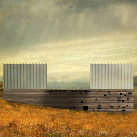
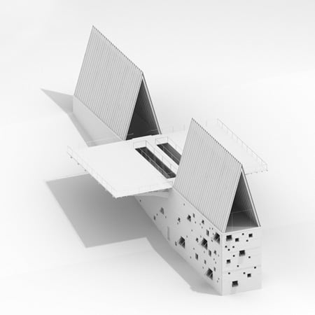
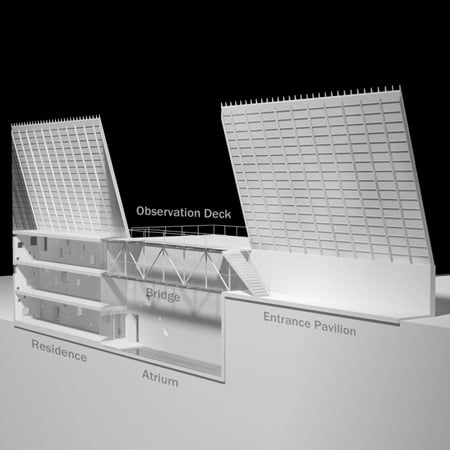
New York studio Axis Mundi have designed a house for a mountainside in Montana, USA, which incorporates a 60 foot internal bridge
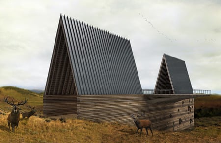
Called Ark House, the building will have an entrance hall at one end sheltered by one of two steeply-sloping roof structures.
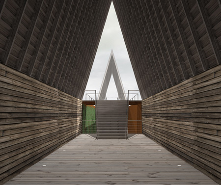
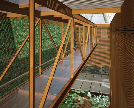
From here residents will cross to the main house in the other end of the long narrow building, either by ascending to a platform that cantilevers out over both sides of the house or via a bridge over a three-storey atrium below.
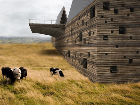
Living areas and bedrooms in the four-storey home will each look out over the mountainside at one end, and into the atrium at the other.
The information below is from Axis Mundi:
ARK HOUSE by Axis Mundi
Madison Valley, Montana, USA
The design for this residence can been likened to the discovery of an archaic sailing vessel, beached on a mountainside, as if a great ocean receded in the ancient past.
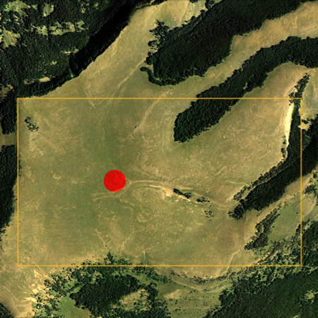
Site
Montana’s Western mountains have been lifted and folded by plate tectonics and sculpted by glaciers over millions of years. The project is situated on a sloping windswept bluff overlooking Beaver Head National Forest with extraordinary views of Big Sky Mountain.
In a world which is increasingly becoming placeless, our clients requested that we design their home with cultural specificity. It should be of its time, yet be part of the place they love – the vast ancient landscape of Montana.
Concept
The overall design is a long barn-like structure bisected across the center by an enormous cantilevered observation deck of nearly 4800 sq. ft.
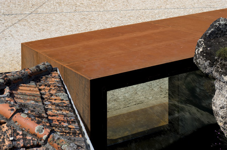
Half of the main form is an open shell which serves as an entrance pavilion. It contains only a staircase leading up to the observation deck. From the deck, one can enter the main house in the other half. There is an alternate, sheltered path under the deck, opening behind the staircase. Fabricated from Corten steel and glass, a 60-foot bridge spans a 3-story atrium space below.
Top Down Plan
On the uppermost level of the house is the main living space which includes kitchen, dining and living areas. Two staircases lead down to bedrooms on three lower levels.
All of the floors have breath-taking mountain views at one end and look in to the atrium at the other. The atrium walls are lined with a Corten steel trellis. A lily pond resides at the base.
Sustainability
This home features near-zero energy use thanks to a high performance building envelope, a geothermal heating and cooling system, and photovoltaic panels that produce as much energy as the home needs each year. The 100-acre site preserves the native landscape.
Axis Mundi is a dynamic interdisciplinary design practice based in New York.
Design: John Beckmann
Design Team: John Beckmann, Ronald Dapsis, Masaru Ogasawara and Natacha Mankowski
Renderings: Ronald Dapsis and Masaru Ogasawara
Total sq. ft.: 10,200 including 4,800 sq. ft. observation deck.
Materials: Reclaimed oak siding and beams, Corten steel, glass, photovoltaic standing seam roof, CMU, steel sub-structure.
| German Pavilion by Schmidhuber + Kaindl (0) | 2010.04.28 |
|---|---|
| Casa Orquidea by Andrés Remy Architects (0) | 2010.04.24 |
| Castelo Novo by Comoco Architects (1) | 2010.04.24 |
| Embassy of the Czech Republic (0) | 2010.04.24 |
| 1111 Lincoln Road by Herzog & de Meuron (0) | 2010.04.21 |

Argentinian studio Andrés Remy Arquitectos have completed a house in Pilar, Buenos Aires, consisting of volumes stacked at sloping angles.
Called Casa Orquidea (Orchid House) the concrete building has large recessed windows, with smaller openings in the south facade.
The following information is from the architects:
Sustainability implies a lot of varieties, such as efficient and rational use of energy and water, natural ventilation and lighting, and low-environment-impact materials. The house has the best orientation, possible thanks to the large lot. The concept came from the client’s hobby, growing orchids. The house is based on the different parts of the orchid: the roots, the stem and the flower.
The sun rays impact in the interior of each room, were also studied, to determine the optimal depth to place the windows. This gives a unique volumetric outcome to the project. Taking advantage of sun rays in winter increases the interior temperature up to a comfortable level. The design includes glazed volumes with good thermal insulation and small windows in the worst orientation, such as the south facade. The windows consist of aluminum frames supplied with thermal bridge breaker and double-hermetic-glass. A wide variety of insulating materials were also used, as well as water based paint and wall and roof air chambers.
In the lower floor, the convenient location of the opening windows allows natural air flow helping to decrease the humidity in the room. What’s more, the big thresholds create a good distribution of fresh air. All this, gives account of the complexity of the house, a glass and concrete flower, designed according to a program of needs and the client’s concerns.
Credits
Design: Andrés Remy Arquitectos
Desing Team: ANDRES REMY, HERNAN PARDILLOS (asociated), LUCILA LOPEZ, PAULA MANCINI, JULIETA RAFEL.
Colaborators: LILIAN KANDUS, CORAL BANEGAS, GISELA COLOMBO, DIEGO SIDDI, MARTIN DELATORRE, JUAN ETALA, SEBASTIAN REMY.
Design Process: six months.
Date of completition: December 2008
Location: The house is located in a closed neighborhood called “Haras del Sol”, in the city of Pilar, province of Buenos Aires, Argentina.
Lot size: 3640m_
Lower floor: 325m_
Upper floor: 140m_
Total: 465m_
| German Pavilion by Schmidhuber + Kaindl (0) | 2010.04.28 |
|---|---|
| Ark House by Axis Mundi (0) | 2010.04.24 |
| Castelo Novo by Comoco Architects (1) | 2010.04.24 |
| Embassy of the Czech Republic (0) | 2010.04.24 |
| 1111 Lincoln Road by Herzog & de Meuron (0) | 2010.04.21 |
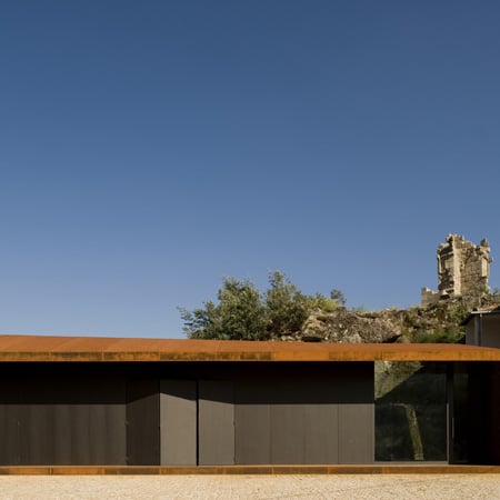
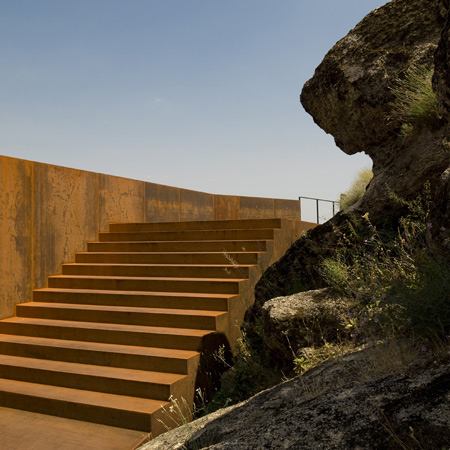
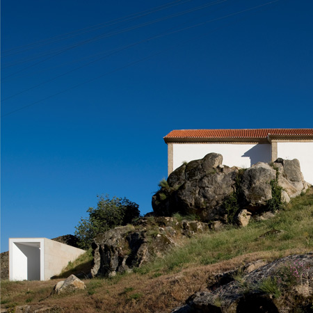
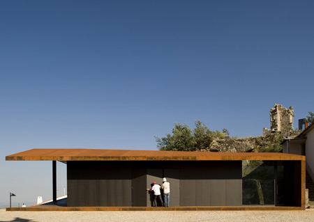
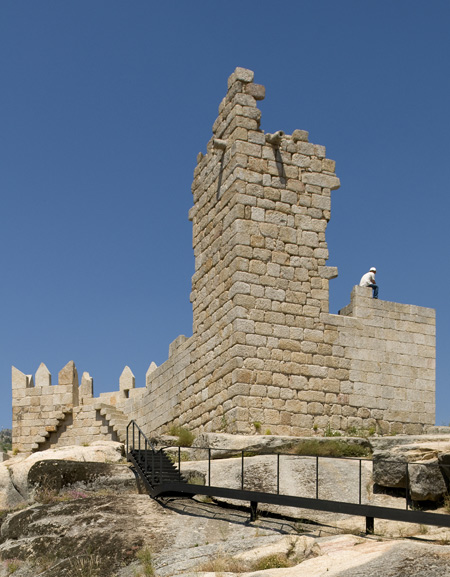
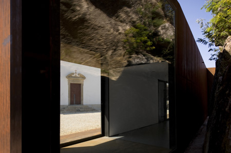
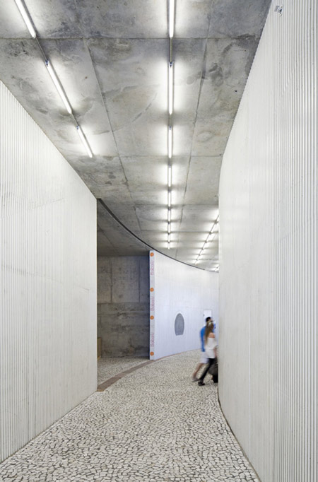
Here are some images of a visitors centre with walkways built through and around a castle in Fundão, Portugal, by Portuguese studio Comoco Architects.
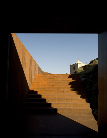
The new addition to the Castelo Novo comprises a pedestrian walkway, ramps and stairs, which guide visitors from a church square through the castle to a multimedia display inside a steel box in the main tower.
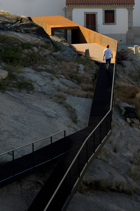
A rectangular structure with a folding facade sits further down the hill from the castle and is where the walkway begins.
Photographs are by Fernando and Sergio Guerra.
The following information is from the architects:
The project’s brief requested the conservation and valorization of Castelo Novo’s Castle and surroundings. Moreover, it suggested also the creation of a space where people and visitors could enjoy it as a place of permanence.
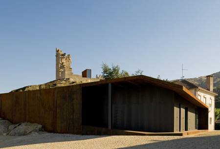
To answer these demands, the design solution created a “body” without a rigid boundary, organic, working independently of the existing structures but using them as a support. The construction was designed as a continuous abstract object, non-identifiable with a unique and specific purpose.
The object changes with the characteristics of the site. While in the church’s square it acts as a volume defining the limits, in the interior of the Castle’s walls, its shape is transformed into a pavement layer with ramps and stairs creating a pedestrian pathway which is suspended from the ground by metallic structure.
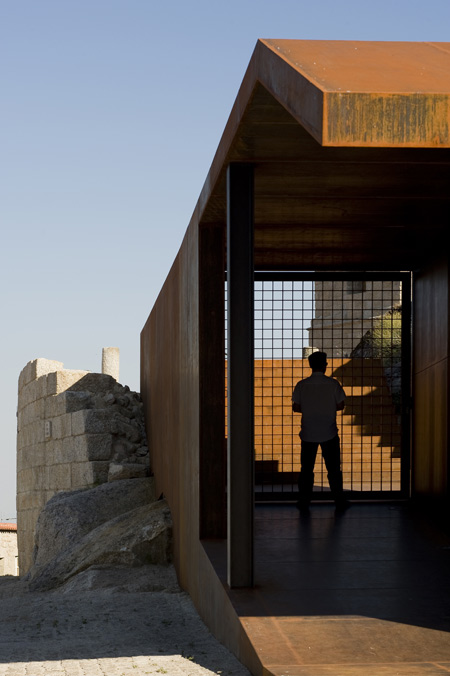
This solution allows the visitors to admire the archeological findings without damaging them. The pathway finishes in the castle’s Main Tower where a “steel box” was inserted in its interior containing a multimedia room.
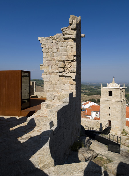
This box allows also the creation of a platform where visitors can enjoy a panoramic view of the landscape. A
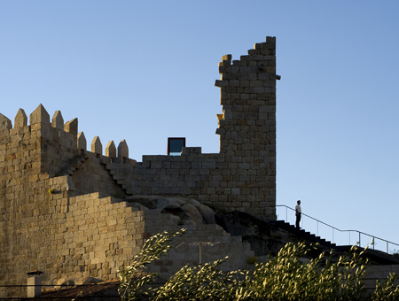
ll the construction was made using lightweight metal structures which can allow a clear distinction of the new object from the existing structures and, at the same time, the reversibility of the operation.
Project Credits
Location: Castelo Novo, Fundão
Client: Fundão Municipality
Architecture: Luís Miguel Correia, Nelson Mota, Susana Constantino with Vanda Maldonado
Date: 2003-2008
Area: 3650m2
Engineering: Direcção-Geral dos Edifícios e Monumentos Nacionais (DGEMN)
Building Contractor: General Contractor: STAP – Reparação, Consolidação e Modificação de Estruturas, S.A.
Landscape: Serrasqueiro e Filhos, lda
Photography: FG+SG – Fotografia de Arquitectura
| Ark House by Axis Mundi (0) | 2010.04.24 |
|---|---|
| Casa Orquidea by Andrés Remy Architects (0) | 2010.04.24 |
| Embassy of the Czech Republic (0) | 2010.04.24 |
| 1111 Lincoln Road by Herzog & de Meuron (0) | 2010.04.21 |
| Liiva House by Muru & Pere (2) | 2010.04.16 |

Czech architects Chalupa Architekti have won a competition to design the new Embassy of the Czech Republic in Washington DC, USA.

Here’s some text from the architects:
The design of the Embassy of the Czech Republic pays tribute to its unique natural setting, and the building itself is only an adjunct, not the main actor. Its form divides the site into three separate parts.

Firstly what emerges is a representational circular driveway space, the austere elegance of which underlines the drapery-like front façade made of frosted glass. Secondly, it creates a private garden space linked to the apartments and offices used for more working-like meetings.

Finally, there is the representational garden space which forms the conceptual core of the project. The garden is generously dimensioned, organically connected with the main lounges of the Embassy, and mediates a strong contact between the new building and the existing residence of the ambassador.

Designing the Embassy of the Czech Republic in Washington poses the special challenge (apart from the obvious creation of an environment suitable for work and meetings) of how to represent the Czech Republic abroad. It does not attempt to show what we are like, but what we would like to be like, or how we wish to be seen to the world: open, confident, friendly, helpful, and respectful, considerate to Nature and the environment in general, firmly rooted in rich cultural traditions and with respect to democratic principles; and always ready to help. Our hope is that the new Embassy building will foster this understanding.

1. prize in a competition to design
Embassy of Czech Republic in Washington, DC, USA
architects: Chalupa architekti / Marek Chalupa, Stepan Chalupa, Tomas Havlicek, Michal Rosicky, Tomas Horalik, Jakub Chuchlik
collaborators: Adam Gebrian, Petr Babak / Laborator, Zdenek Sendler, Vit Musil + Radim Petruska / miss3
location: 3900 Spring of Freedom St. NW, Washington, DC, USA
client: Czech Republic – Ministry of Foreign Affairs
design period: 07/2009–02/2010
gross floor area: 5 490m2
| Casa Orquidea by Andrés Remy Architects (0) | 2010.04.24 |
|---|---|
| Castelo Novo by Comoco Architects (1) | 2010.04.24 |
| 1111 Lincoln Road by Herzog & de Meuron (0) | 2010.04.21 |
| Liiva House by Muru & Pere (2) | 2010.04.16 |
| Swarovski Crystal Palace 2010 (0) | 2010.04.16 |
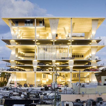
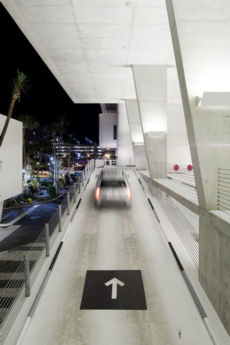
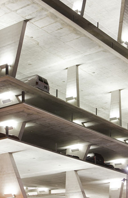
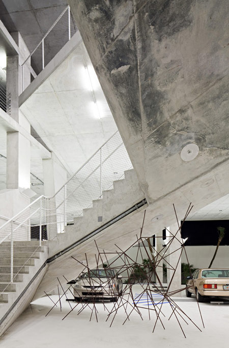
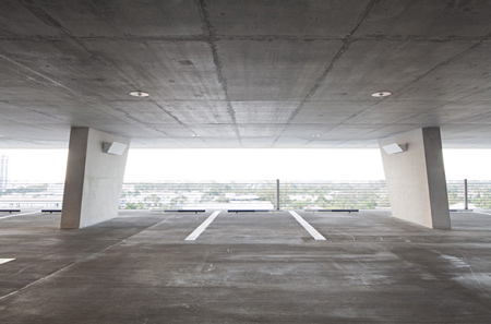
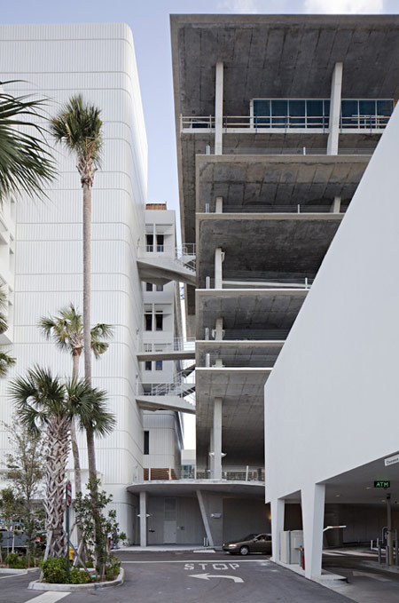
Photographer Nelson Garrido has sent us these photographs of the recently-opened car park in Miami by Swiss architects Herzog & de Meuron.
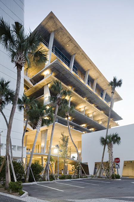
Called 1111 Lincoln Road, the building incorporates 300 parking spaces.
Eleven shops and three restaurants are located at ground level, with further shopping on the fifth floor and another restaurant on the roof.
All photographs ©Nelson Garrido/1111Lincoln Road Shot Reprinted with permission from MBeach1, LLLP
The information below is from the developers:
Situated at the gateway to Lincoln Road’s pedestrian promenade, 1111’s mix of exclusive, internationally diverse retailers will once again restore this long-dormant strip to its former position as the city’s premier retail location.
Constructed of concrete and glass, 1111 Lincoln Road is described by architect Jacques Herzog as pure Miami Beach – “all muscle without cloth”.

Each level of the sculptural parking facility is filled with natural light, creating successively striking vistas of the city.
At its base, the retail spaces offer unobstructed access to a newly transformed public space.
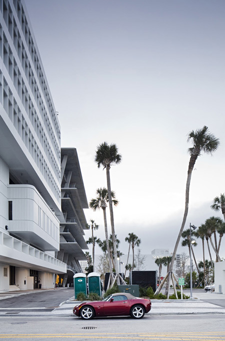
1111 encompasses 40,000 square feet for 11 street-level retail concept stores and three restaurants, as well as a uniquely-situated 5th floor retail store.
| Castelo Novo by Comoco Architects (1) | 2010.04.24 |
|---|---|
| Embassy of the Czech Republic (0) | 2010.04.24 |
| Liiva House by Muru & Pere (2) | 2010.04.16 |
| Swarovski Crystal Palace 2010 (0) | 2010.04.16 |
| Autostella by Supermachine Studio (0) | 2010.04.13 |
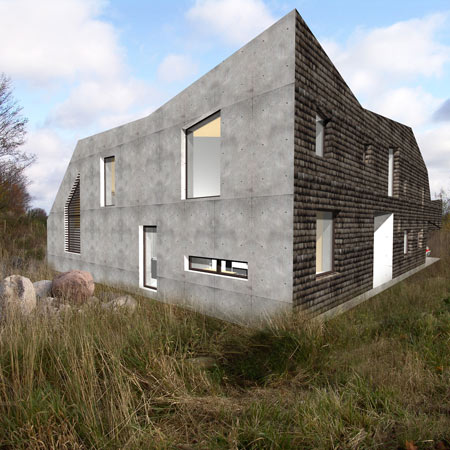
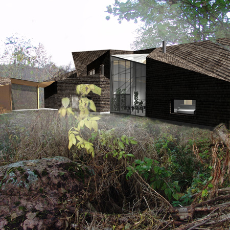
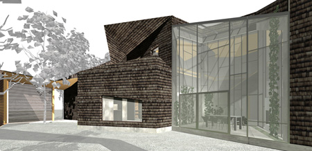
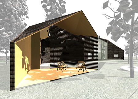
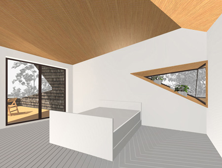
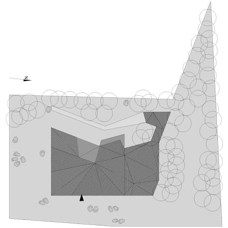
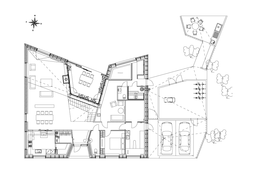
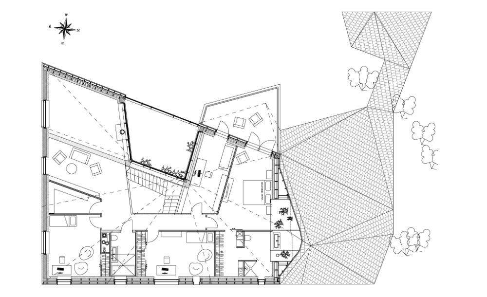
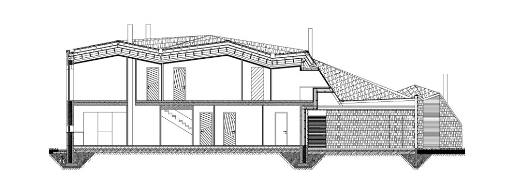
Estonian architects Urmas Muru and Peeter Pere have designed a house for a fishing village near Tallinn, covered in shingles on all surfaces except for one white concrete wall.
Called Liiva House, the building has a faceted roof creating an angular form with irregularly-spaced windows.
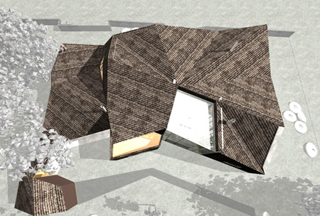
There is a full-height glass wall located at the rear of the house that creates a conservatory space.
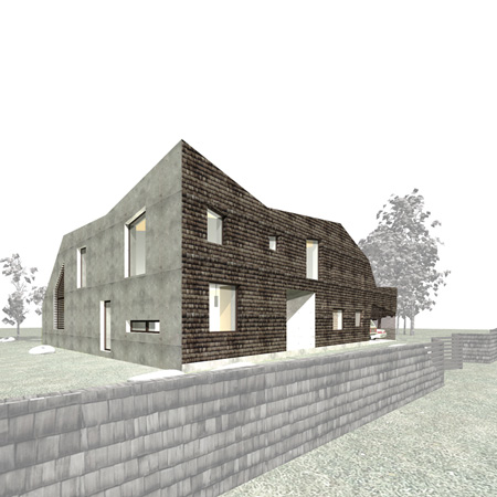
A room with only three external walls sits at the rear of the house and is open to the garden.
The project is due for construction later this year.
The following information is from the architect:
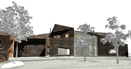
The shape has been derived from sea side stack of boulders.
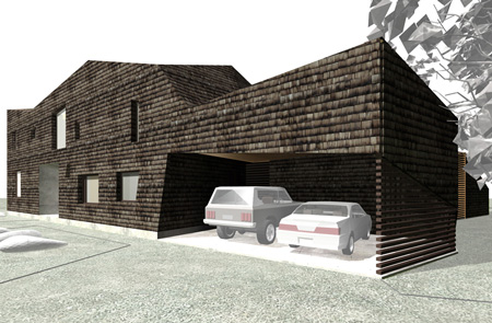
More firm and traditional facade is exposed to the street.
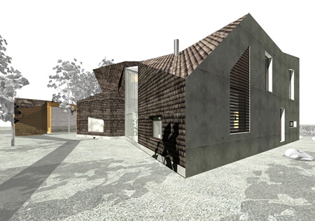
The courtyard is more expressive,wild, opened, communicating.
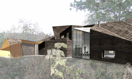
The master key of the plan solution is the butterfly tie shaped main axes of the winter garden.
It is surrounded by the rooms which compose traditional Estonian home- living room, kitchen, bedrooms, guest room, study, sauna.
The external walls and roof use tarres larch shingles.
Southern wall is of white concrete.
The wooden surfaces in the yard maily consists of untreated laurch.
Project Information
Designed: October 2008
Construction: November 2010
Site area: 1694m²
Net area: 300m²
Materials: white concrete, larch shingle, pine boarding
Architects team: Urmas Muru, Peeter Pere, Janek Maat, Doris orasi
Location: Tallinn, Estonia
Click for larger image
Click for larger image
| Embassy of the Czech Republic (0) | 2010.04.24 |
|---|---|
| 1111 Lincoln Road by Herzog & de Meuron (0) | 2010.04.21 |
| Swarovski Crystal Palace 2010 (0) | 2010.04.16 |
| Autostella by Supermachine Studio (0) | 2010.04.13 |
| 프랭크 게리와의 대화(In Conversation with Frank Gehry) (1) | 2010.04.06 |

|